


HEATMAPS
In a heatmap, the values of a measure are shown with circles of varying sizes. Higher values are assigned larger circles that are colored more intensely—hence the name heatmap. The values can be arranged in a matrix, similar to what you saw in the highlight table.
Step 1: Build the Table
To create a heatmap in Tableau, you follow the same steps you used to build a highlight table, except that the measure Sales is added to Color and Size, not Color and Text. In addition, change the mark type Circle in the drop‐down menu on the Marks card.
Finally, it makes sense to give the table all the available space by selecting Entire View, instead of Standard, in the drop‐down menu on the toolbar just above the canvas. See Figure 3.21.
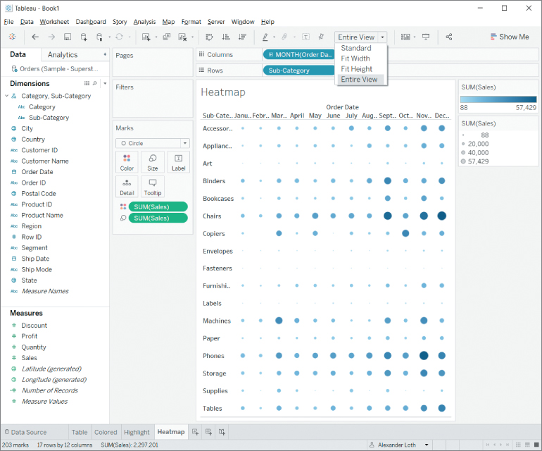
Figure 3.21 Heatmap with marks in different sizes and colors, depending on the values they represent—expanded to show the Entire View.
Step 2: Choose an Interesting Color Palette
In order to do the heatmap justice and make...


