On top of the mean, standard deviation, and quartiles that we can see from the DataFrame description, we also need to look at the real data distribution. The following figure illustrates the importance of data visualization:
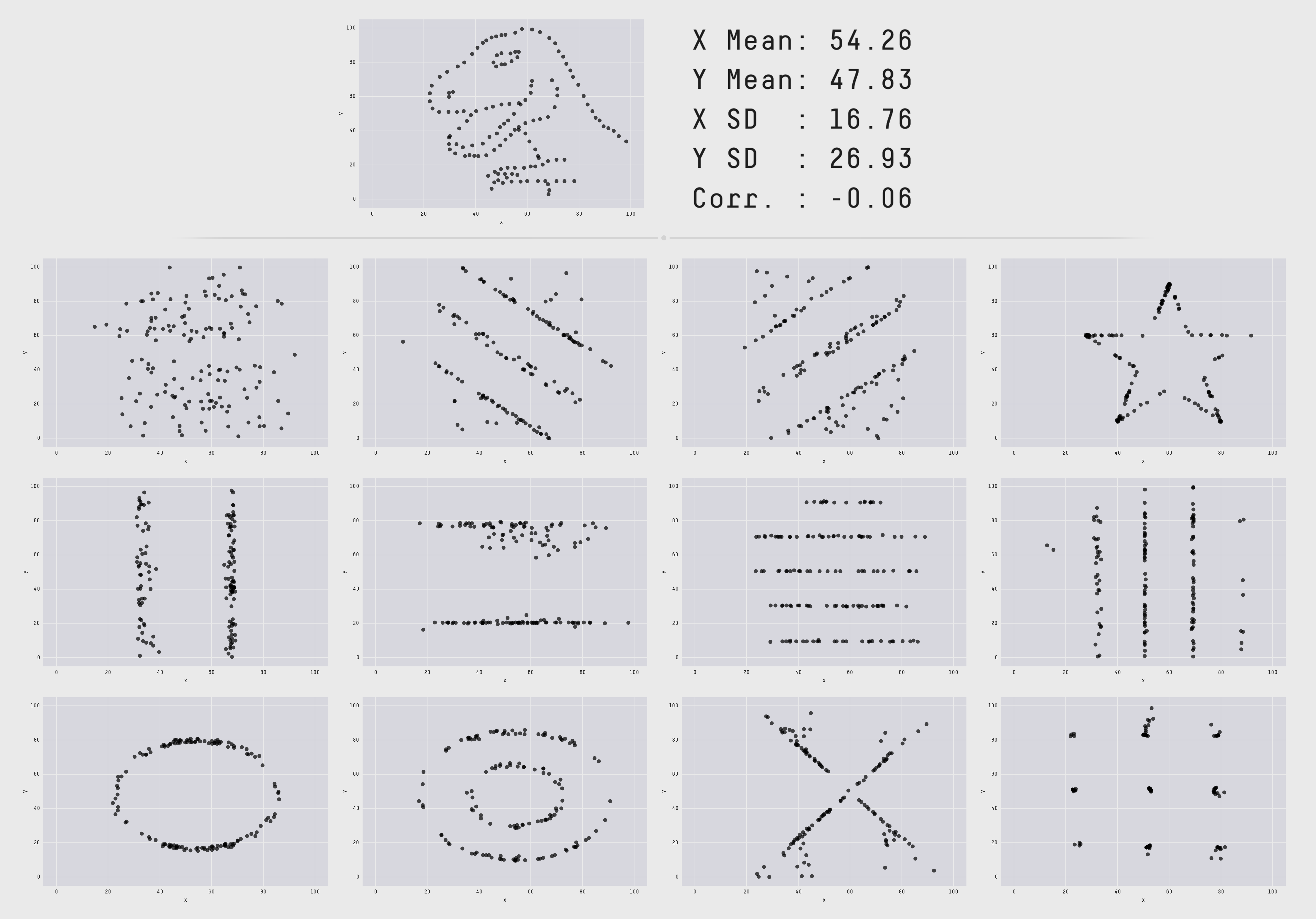
Image from Same Stats, Different Graphs: Generating Datasets with Varied Appearance and Identical Statistics through Simulated Annealing by J. Matejka and G. Fitzmaurice, available at https://www.autodeskresearch.com/publications/samestats
This figure shows 13 datasets of two variables: x and y. In each of these datasets, the mean value of the x variable is 54.26 and the mean value for y is 47.83. They also share the exact same standard deviation (up to two-digit precision) and the same correlation between x and y. However, the shape is totally different and if you were to select an algorithm to predict y from x, you probably wouldn't pick the same method for the lower-left dataset (the circle) as for the cross.
We will continue...