Presenting data with a line chart in a story
In this example, you will learn how to use a line chart that shows a trend in the data values, especially for dimensions that are time-based, such as year or the progression of your data and possible patterns.
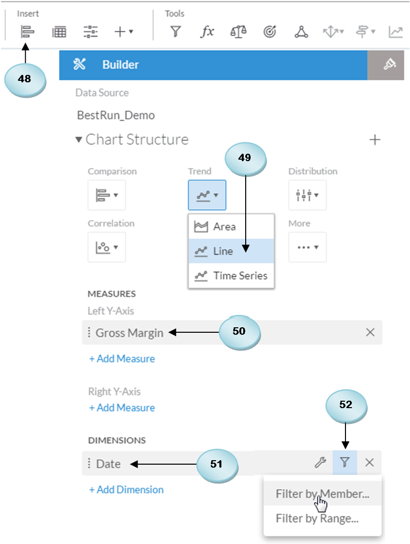
- Click on the Chart icon to insert a blank chart.
- Select the
line chartoption from the trend list. - Select
Gross Marginas the measure for this chart. - Add the
Datedimension from theDimensionssection.
- After adding the
Datedimension, click on the filter icon, and then selectFilter by Memberfrom its menu:
Applying filters to the time dimension
In SAP Analytics cloud, you can apply filters to your story and page to narrow down the scope of your analysis. In addition to these filters, you can add filters to individual dimensions that appear on your charts. For this example, you are going to add a filter to the date-time dimension that you added to your chart in the previous step. You are provided with a couple of options for applying filters on...