Search icon CANCEL
Subscription
0
Cart icon
Your Cart (0 item)
Close icon
You have no products in your basket yet
Save more on your purchases! discount-offer-chevron-icon
Savings automatically calculated. No voucher code required.
Arrow left icon
All Products
Best Sellers
New Releases
Books
Videos
Audiobooks
Learning Hub
Newsletter Hub
Free Learning
Arrow right icon
timer SALE ENDS IN
0 Days
:
00 Hours
:
00 Minutes
:
00 Seconds
Arrow up icon
GO TO TOP
Visual Analytics with Tableau

You're reading from   Visual Analytics with Tableau A four-color journey through a complete Tableau visualization

Arrow left icon
Product type Paperback
Published in May 2017
Publisher Wiley
ISBN-13 9781119560203
Length 288 pages
Edition 1st Edition
Tools
Arrow right icon
Author (1):
Arrow left icon
Alexander Loth Alexander Loth
Author Profile Icon Alexander Loth
Alexander Loth
Arrow right icon
View More author details
Toc

Table of Contents (16) Chapters Close

1. Cover FREE CHAPTER
2. Foreword by Nate Vogel
3. Foreword by Sophie Sparkes
4. Introduction 5. Chapter 1: Introduction and Getting Started with Tableau 6. Chapter 2: Adding Data Sources in Tableau 7. Chapter 3: Creating Data Visualizations 8. Chapter 4: Aggregate Functions, Calculated Fields, and Parameters 9. Chapter 5: Table Calculations and Level of Detail Calculations 10. Chapter 6: Maps 11. Chapter 7: Advanced Analytics: Trends, Forecasts, Clusters, and other Statistical Tools 12. Chapter 8: Interactive Dashboards 13. Chapter 9: Sharing Insights with Colleagues and the World 14. Chapter 10: Data Preparation with Tableau Prep 15. Index
16. End User License Agreement

CUMULATIVE SUMS WITH WATERFALL CHARTS

Waterfall charts effectively show the cumulative sum of a series of positive and negative values. The chart shows the starting value, the end value, and the incremental steps of the series. That is to say, you can see both the total change as well as the differences between consecutive values.

To create a waterfall chart, you need a dimension and a measure. From the Superstore sample data set, you can use the Sales measure and the Sub‐Category dimension.

Step 1: Sorted Bar Chart

You begin by creating a bar chart and sorting the bars by the values they represent. Pull the Sales measure onto Rows and the Sub‐Category dimension onto the Columns shelf. Then sort the data by sales revenue, in ascending order, by twice clicking the sort button that appears when you hover with the mouse over the vertical axis (see Figure 3.27).

Screenshot of the sort option appears when you hover over an axis.

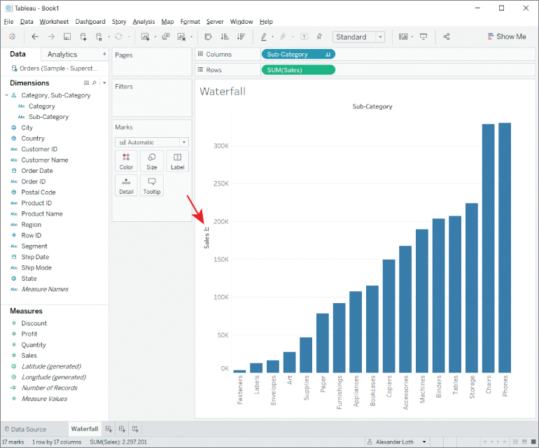
Figure 3.27 The sort option appears when you hover over an axis.

Step 2: Cumulative Sum and Gantt bars

Next...

lock icon The rest of the chapter is locked
Register for a free Packt account to unlock a world of extra content!
A free Packt account unlocks extra newsletters, articles, discounted offers, and much more. Start advancing your knowledge today.
Unlock this book and the full library FREE for 7 days
Get unlimited access to 7000+ expert-authored eBooks and videos courses covering every tech area you can think of
Renews at £13.99/month. Cancel anytime
Visually different images