Search icon CANCEL
Subscription
0
Cart icon
Your Cart (0 item)
Close icon
You have no products in your basket yet
Save more on your purchases! discount-offer-chevron-icon
Savings automatically calculated. No voucher code required.
Arrow left icon
All Products
Best Sellers
New Releases
Books
Videos
Audiobooks
Learning Hub
Newsletter Hub
Free Learning
Arrow right icon
timer SALE ENDS IN
0 Days
:
00 Hours
:
00 Minutes
:
00 Seconds
Arrow up icon
GO TO TOP
Visual Analytics with Tableau

You're reading from   Visual Analytics with Tableau A four-color journey through a complete Tableau visualization

Arrow left icon
Product type Paperback
Published in May 2017
Publisher Wiley
ISBN-13 9781119560203
Length 288 pages
Edition 1st Edition
Tools
Arrow right icon
Author (1):
Arrow left icon
Alexander Loth Alexander Loth
Author Profile Icon Alexander Loth
Alexander Loth
Arrow right icon
View More author details
Toc

Table of Contents (16) Chapters Close

1. Cover FREE CHAPTER
2. Foreword by Nate Vogel
3. Foreword by Sophie Sparkes
4. Introduction 5. Chapter 1: Introduction and Getting Started with Tableau 6. Chapter 2: Adding Data Sources in Tableau 7. Chapter 3: Creating Data Visualizations 8. Chapter 4: Aggregate Functions, Calculated Fields, and Parameters 9. Chapter 5: Table Calculations and Level of Detail Calculations 10. Chapter 6: Maps 11. Chapter 7: Advanced Analytics: Trends, Forecasts, Clusters, and other Statistical Tools 12. Chapter 8: Interactive Dashboards 13. Chapter 9: Sharing Insights with Colleagues and the World 14. Chapter 10: Data Preparation with Tableau Prep 15. Index
16. End User License Agreement

SYMBOL MAPS

If Tableau recognizes that your data contains geographic dimensions (as indicated by the globe symbol next to the field name), it takes less than five seconds to create a map. Simply double‐click the geographic dimension(s) you want to use, and then double‐click one or more measures that you want to see on the map.

You can try this with the Superstore sample dataset by double‐clicking first the three geographic dimensions Country, State, and City, and then the measure Sales. The geographic dimensions give you a symbol map showing the cities contained in the dataset, while Sales is automatically added to Size on the Marks card—meaning the size of the circles now reflects the sum of sales revenue coming from the different cities.

Double‐clicking yet another measure such as Profit adds this measure to Color, and the circles are now shaded according to the sum of profits in the different cities. See Figure 6.1.

Screenshot of symbol map with differently sized circles, based on the revenue in the different cities.

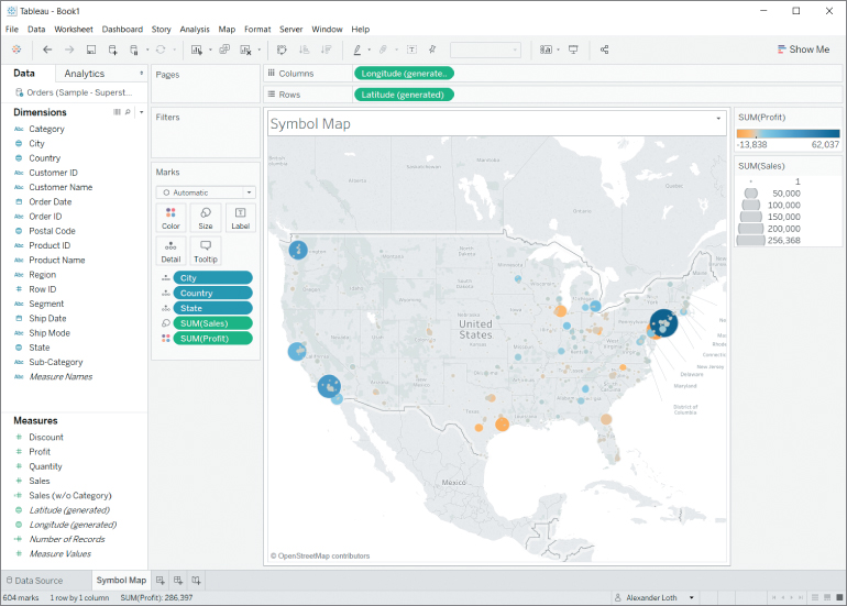
Figure 6.1 Symbol map with differently...

lock icon The rest of the chapter is locked
Register for a free Packt account to unlock a world of extra content!
A free Packt account unlocks extra newsletters, articles, discounted offers, and much more. Start advancing your knowledge today.
Unlock this book and the full library FREE for 7 days
Get unlimited access to 7000+ expert-authored eBooks and videos courses covering every tech area you can think of
Renews at £13.99/month. Cancel anytime
Visually different images