


UI Toggle
The UI Toggle object is an interactable checkbox with a label.
To create a UI Toggle, select Create | UI | Toggle. By default, a UI Toggle has two children: a Background and a Label. The Background also has a child, a Checkmark.
The Background child is a UI Image that represents the "box" in which the Checkmark UI Image appears. The Label is a UI Text object.
If you want to change the appearance of the box and checkmark, you change the source images of the Image components on the Background and Checkmark children, respectively.
Toggle component
The parent Toggle object has a Toggle component. The Toggle component looks very similar to the Button component and has many of the same properties. As you'll see in this chapter, the first few properties of all interactable UI objects are the same. The properties at the bottom of the component are the ones that are exclusive to the UI Toggle object:
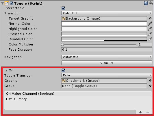
The Is On property determines whether the Toggle is checked or not when it is initialized in...


