


Transitions
The second property of the Button component is the Transition
There are four different types of Transitions you can assign: None, Color Tint, Sprite Swap, and Animation.
None
Selecting None for the Transition type would mean that the button will not visually change for the different states:

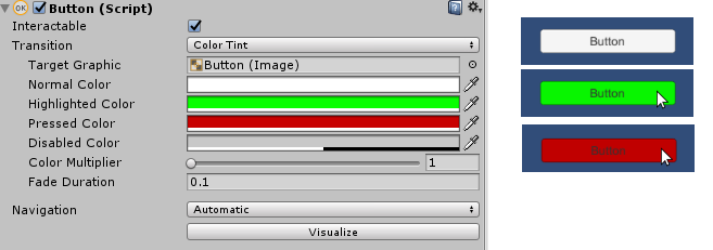
Color Tint
The Color TintTransition type will make the button change color based on its state. You assign the Normal Color, Highlighted Color, Pressed Color, and Disabled Color.
In the following example, you can see that the button changes to the color green when the mouse is hovering over it (hence, highlighting it) and turns red as the mouse is being pressed down on it:
Color Swap Example in the Chapter5Text Scene...


