Bubble chart
In this section, we're going to create the following bubble chart. This chart shows which word throughout all the Simpsons episodes is spoken the most by a specific character:
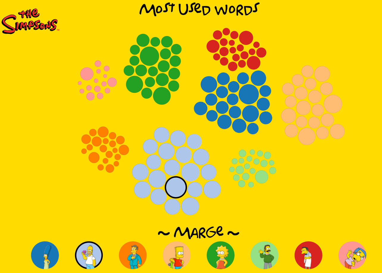
This bubble chart has the following features:
- The size of a circle represents how often that word is spoken
- It uses a force layout to position the bubbles
- We use a custom force function to group the words together for each character
- You can drag and drop individual words
- When you hover over a word, the word is shown at the bottom, and the character who said it is highlighted
But first we need to create the data that we'll use for this chart.
Getting the data
For this data, we're going to use the same database we used in the beginning of this chapter. This time we're going to use the data in the script_lines table, but only for the main characters that we want to show. In this case, we'll use Marge, Homer, Skinner, Bart, Lisa, Ned, Moe, and Millhouse. The words we'll use look like this:
character_id,raw_character_text...