
Adding Google Charts to your dashboard
In this section, we will look at the different Google Charts that are available, and talk about why you might want to use them. We will see how to add them to a Shiny application. We will also see how to reskin your dashboard to a different color.
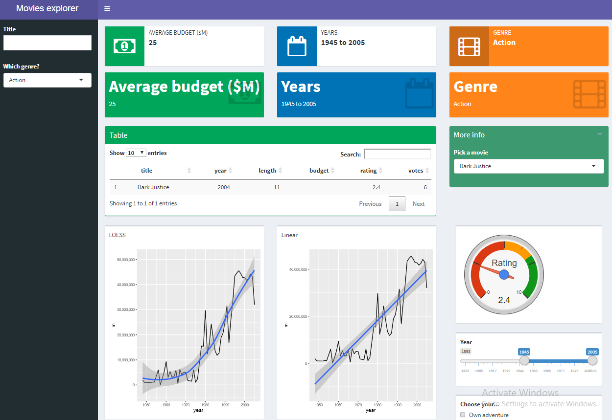
Google Charts is a free resource with which you can draw statistical graphics on any web page. They need an internet connection to work, but other than that limitation they're extremely easy to use, perhaps even easier in Shiny using the googleVis package. You will need to install this package with install.packages("googleVis"). There's a gallery of the different graphics available at https://developers.google.com/chart/interactive/docs/gallery. For our dashboard, we selected the gauge control, which is an attractive addition to the dashboard, and not possible with besar or ggplot. Although, it is possible in other contributors.
Let's have a look at the application:
As you can see, we've changed the header of...