


TieredMenu – sub-menus in nested overlays
The TieredMenu component displays the sub-menus in a nested Overlays mode. By default, the slide menu is displayed as an inline menu component. A basic tiered menu example, which displays the document or file type menu would be as follows:
<p-tieredMenu [model]="items"></p-tieredMenu>
The list of menu items needs to be organized with in a component class. For example, a root menu item titled File will have nested items as shown here:
this.items = [
 {
   label: 'File',
   icon: 'fa-file-o',
   items: [
 {
   label: 'New',
   icon: 'fa-plus',
   items: [
   {label: 'Project'},
   {label: 'Other'},
 ]
 },
   {label: 'Open'},
   {label: 'Quit'}
 },
 // more items
]
The following screenshot shows a snapshot result of the basic tiered menu example:
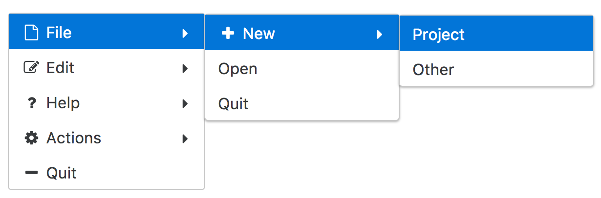
As seen in the preceding snapshot, the slide menu is displayed in an inline format. It will be displayed in pop-up mode by enabling the popup property. PrimeNG 4.1 introduced the appendTo property to...