


Tooltips for form components
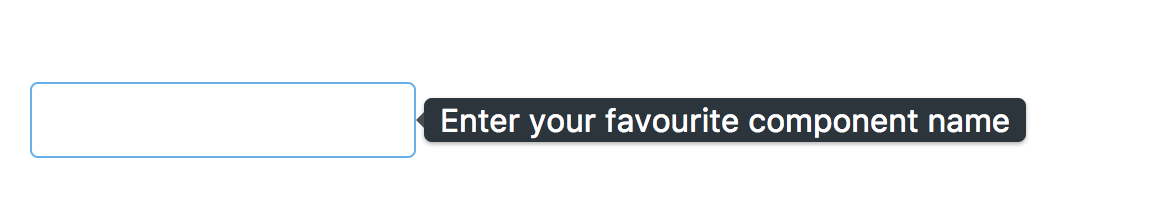
Tooltip provides an advisory information for a component. This gives a brief insight of target component before going to use. The Tooltip is applied through the pTooltip directive with the value to define text to display. Along with that, HTML tags also displayed instead of regular text information with the help of the escape attribute. A basic example of Tooltip is to provide an advisory information for input as follows:
<input type="text" pInputText pTooltip="Enter your favourite component
  name" >
The Tooltip display on right side of input as shown in the following screenshot:
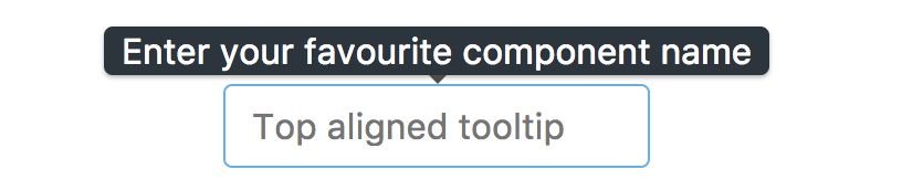
The Tooltip position is displayed on the right side of target component by default. This behavior can be changed using the tooltipPosition property with other values such as top, right, and bottom, for example, tooltipPosition with the top value will result as in the following screenshot:
By default, the Tooltip is displayed on hover of a target element (that is, the default event...