


Multipurpose scenarios with OverlayPanel
The OverlayPanel is a container component that displays additional information on top of the other components in the page. This element will be displayed using the show or toggle method of a local ng-template variable, and it can be hidden using the hide or toggle method. Remember that the show method will allow a second argument as the target element, where it has to display the Overlay (instead source). A basic example of the Overlay component with the source button generator will be written as follows:
<p-overlayPanel #overlaybasic>
  <img src="/assets/data/images/primeng.png" alt="PrimeNG Logo" />
</p-overlayPanel>
<button type="button" pButton label="Logo" (click)="overlaybasic.toggle($event)"></button>
In the preceding example, Overlay will appear by the click of the Button component. The following screenshot shows a snapshot result of the basic Overlay example:
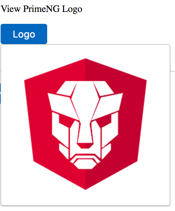
In the preceding snapshot, the Overlay displays the PrimeNG...