Search icon CANCEL
Subscription
0
Cart icon
Your Cart (0 item)
Close icon
You have no products in your basket yet
Save more on your purchases! discount-offer-chevron-icon
Savings automatically calculated. No voucher code required.
Arrow left icon
All Products
Best Sellers
New Releases
Books
Videos
Audiobooks
Learning Hub
Newsletter Hub
Free Learning
Arrow right icon
timer SALE ENDS IN
0 Days
:
00 Hours
:
00 Minutes
:
00 Seconds
Arrow up icon
GO TO TOP
Jupyter Cookbook

You're reading from   Jupyter Cookbook Over 75 recipes to perform interactive computing across Python, R, Scala, Spark, JavaScript, and more

Arrow left icon
Product type Paperback
Published in Apr 2018
Publisher Packt
ISBN-13 9781788839440
Length 238 pages
Edition 1st Edition
Languages
Tools
Arrow right icon
Author (1):
Arrow left icon
 Toomey Toomey
Author Profile Icon Toomey
Toomey
Arrow right icon
View More author details
Toc

Table of Contents (17) Chapters Close

Title Page
Copyright and Credits
Packt Upsell
Contributors
Preface
1. Installation and Setting up the Environment FREE CHAPTER 2. Adding an Engine 3. Accessing and Retrieving Data 4. Visualizing Your Analytics 5. Working with Widgets 6. Jupyter Dashboards 7. Sharing Your Code 8. Multiuser Jupyter 9. Interacting with Big Data 10. Jupyter Security 11. Jupyter Labs Index

Create a Python dashboard


We will use somewhat similar graphics and data derived from the same dataset as before to produce a dashboard based on Python coding.

How to do it...

We have the coding as follows.

We first load all the imports used. We also set up matplotlib to draw graphics inline in our Notebook. We also preconfigure the image sizes:

import pandas as pd
import numpy as np
import statsmodels.formula.api as sm
import matplotlib.pylab as plt
%matplotlib inline
from matplotlib.pylab import rcParams
rcParams['figure.figsize'] = 15, 6

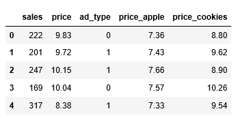
We read in the data and display the first few records:

data = pd.read_csv("Documents/grapeJuice.csv")
data.head()

The following is the output:

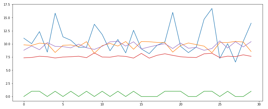
We scale down the sales figures as the other factors are much smaller. Then we produce a scatter plot of the set:

data["sales"] = data["sales"] / 20
plt.plot(data); #suppresses extraneous matplotlib messages

The following is the output:

Next, we produce a regression analysis on the data:

Y = data['sales'][:-1]
X = data[['price...
lock icon The rest of the chapter is locked
Register for a free Packt account to unlock a world of extra content!
A free Packt account unlocks extra newsletters, articles, discounted offers, and much more. Start advancing your knowledge today.
Unlock this book and the full library FREE for 7 days
Get unlimited access to 7000+ expert-authored eBooks and videos courses covering every tech area you can think of
Renews at £13.99/month. Cancel anytime
Visually different images