


Sometimes, you need a screen layout that flows like a grid. For example, what if you have several sections that are the same width and height, but you're not sure how many of these sections will be rendered? The Flexbox makes it easy to build a row that flows from left to right until the end of the screen is reached. Then, it automatically continues rendering elements from left to right on the next row.
Here's an example layout in portrait mode:
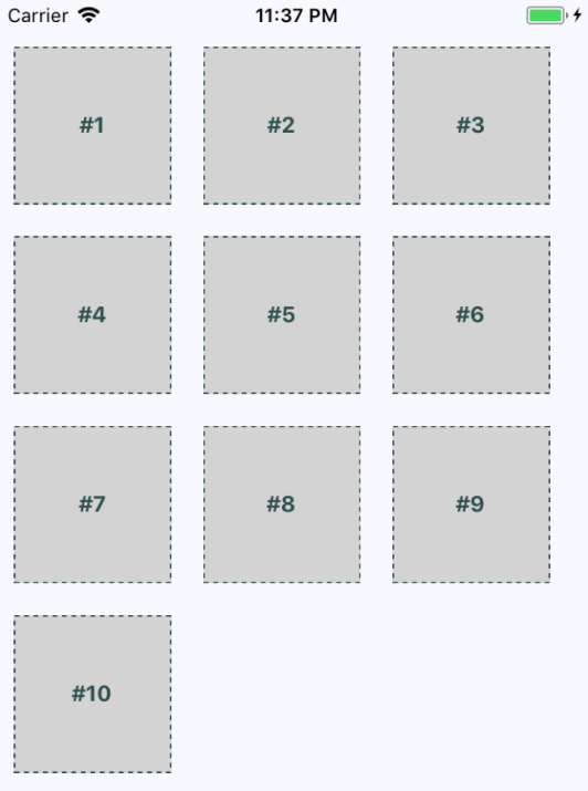
The beauty of this approach is that you don't need to know in advance how many columns are in a given row. The dimensions of each child determine what will fit in a given row. Let's take a look at the styles used to create this layout:
import { Platform, StyleSheet, StatusBar } from 'react-native';

export default StyleSheet.create({
  container: {
    flex: 1,
    flexDirection: 'row',
    flexWrap: 'wrap',
    backgroundColor: 'ghostwhite',
    alignItems: 'center&apos...