


Using Bootstrap Responsive layouts
One of the best reasons to use a CSS framework such as Bootstrap is to more easily support responsive layouts in our web application. Using Bootstrap's layout classes and breakpoints, we can easily add responsive design to our Angular application.
Getting ready
Bootstrap 4 supports a modern flex-box-based responsive grid system. To use the grid system, we will need to declare a container that will contain the grid, rows for each line of elements we will lay out in the container, and columns for each item in the row:
>
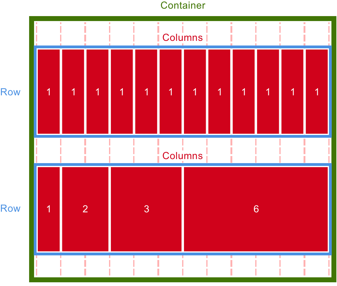
We can compose any combination of column widths together that we want as long as the total within the row adds up to 12 or fewer. Otherwise our column content will wrap to the next row and begin filling out the next row of 12 columns.
How to do it...
Now that we have Bootstrap loaded in our application, let's make the blog post page in our app responsively scale all the way down to mobile phone-sized devices:
- Here is a simple example of a responsive...


