


Grouping radio buttons
In this application, we will learn to create two groups of radio buttons. The user can select radio buttons from either group and accordingly the result or text will appear on the screen.
Getting ready
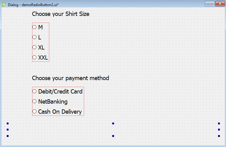
We will display a dialog that displays shirts of different sizes and different payment methods. On selecting a shirt size and a payment method, the selected shirt size and payment method will be displayed on the screen. We will create two groups of radio buttons, one of the shirt sizes and other payment methods. The shirt size group displays four radio buttons showing four different types of the size such as M, L, XL, and XXL, where M stands for medium size, L stands for large size, and so on. The payment method group displays three radio buttons, Debit/Credit Card, NetBanking, and Cash On Delivery. The user can select any radio button from either of the groups. When the user selects any of the shirt sizes or payment methods, the selected shirt size and payment method will be displayed.
How to do it...
Let's recreate the preceding application step by step:
- Create a new application based on the
Dialog without Buttonstemplate. - Drag and drop three
Labelwidgets and sevenRadio Buttonwidgets. Out of these seven radio buttons, we will arrange four radio buttons in one vertical layout and the other three radio buttons in the second vertical layout. The two layouts will help in grouping these radio buttons. Radio buttons being mutually exclusive will allow only one radio button to be selected from a layout or group. - Set the
textproperty of the first twoLabelwidgets toChoose your Shirt SizeandChoose your payment methodrespectively. - Delete the
textproperty of the thirdLabelwidget because we will display the selected shirt size and payment method through the code. - In the
Property Editorwindow, increase the font size of all the widgets to increase their visibility in the application. - Set the
textproperty of the first four radio buttons toM,L,XL, andXXL. Arrange these four radio buttons into one vertical layout. - Set the
textproperty of the next three radio buttons toDebit/Credit Card,NetBanking, andCash On Delivery. Arrange these three radio buttons into a second vertical layout. Remember, these vertical layouts help by grouping these radio buttons. - Change the object names of the first four radio buttons to
radioButtonMedium,radioButtonLarge,radioButtonXL, andradioButtonXXL.
- Set the
objectNameproperty of the firstVBoxLayoutlayout toverticalLayout. TheVBoxLayoutlayout will be used for aligning radio buttons vertically. - Change the object names of next three radio buttons to
radioButtonDebitCard,radioButtonNetBanking, andradioButtonCashOnDelivery. - Set the
objectNameproperty of the secondQVBoxLayoutobject toverticalLayout_2. - Set the
objectNameproperty of the thirdLabelwidget tolabelSelected. It is through thisLabelwidget that the selected shirt size and payment method will be displayed. - Save the application with the name
demoRadioButton2.ui. - Now, the form will appear, as shown in the following screenshot:
The .ui (XML) file is then converted into Python code through the pyuic5 command utility. You can find the Python code, demoRadioButton2.py, in the source code bundle for this book.
- Import the
demoRadioButton2.pyfile, as a header file in our program to invoke the user interface design and to write code to display the selected shirt size and payment method through aLabelwidget when the user selects or unselects any of the radio buttons.
- Let's name the program
callRadioButton2.pyw; its code is shown here:
import sys
from PyQt5.QtWidgets import QDialog, QApplication
from demoRadioButton2 import *
class MyForm(QDialog):
    def __init__(self):
        super().__init__()
        self.ui = Ui_Dialog()
        self.ui.setupUi(self)
        self.ui.radioButtonMedium.toggled.connect(self.
        dispSelected)
        self.ui.radioButtonLarge.toggled.connect(self.
        dispSelected)
        self.ui.radioButtonXL.toggled.connect(self.dispSelected)
        self.ui.radioButtonXXL.toggled.connect(self.
        dispSelected)
        self.ui.radioButtonDebitCard.toggled.connect(self.
        dispSelected)
        self.ui.radioButtonNetBanking.toggled.connect(self.
        dispSelected)
        self.ui.radioButtonCashOnDelivery.toggled.connect(self.
        dispSelected)
        self.show()
    def dispSelected(self):
        selected1="";
        selected2=""
        if self.ui.radioButtonMedium.isChecked()==True:
            selected1="Medium"
        if self.ui.radioButtonLarge.isChecked()==True:
            selected1="Large"
        if self.ui.radioButtonXL.isChecked()==True:
            selected1="Extra Large"
        if self.ui.radioButtonXXL.isChecked()==True:
            selected1="Extra Extra Large"
        if self.ui.radioButtonDebitCard.isChecked()==True:
            selected2="Debit/Credit Card"
        if self.ui.radioButtonNetBanking.isChecked()==True:
            selected2="NetBanking"
        if self.ui.radioButtonCashOnDelivery.isChecked()==True:
            selected2="Cash On Delivery"
        self.ui.labelSelected.setText("Chosen shirt size is
        "+selected1+" and payment method as " + selected2)
if __name__=="__main__":
    app = QApplication(sys.argv)
    w = MyForm()
    w.show()
    sys.exit(app.exec_())
How it works...
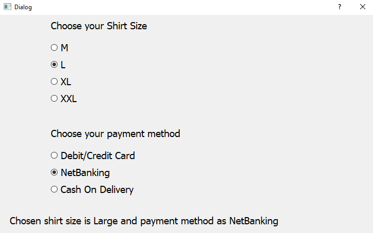
The toggled() event of all the radio buttons is connected to the dispSelected() function, which will display the selected shirt size and payment method. In the dispSelected() function, you check the status of the radio buttons to find out whether they are checked or unchecked. On the basis of the selected radio button in the first vertical layout, the value of the selected1 variable will be set to Medium, Large, Extra Large, or Extra Extra Large. Similarly, from the second vertical layout, depending on the radio button selected, the value of theselected2variable will be initialized toDebit/Credit Card,NetBanking, orCash On Delivery. Finally, the shirt size and payment method assigned to theselected1variable and selected variables will be displayed via the labelSelectedwidget. On running the application, you get a dialog prompting you to select the shirt size and payment method. On selecting a shirt size and payment method, the selected shirt size and payment method are displayed via the Labelwidget, as shown in the following screenshot:


