
Using timechart to show values over time
The timechart option lets us show numerical values over time. It is similar to the chart command, except that time is always plotted on the x axis. Here are a couple of things to note:
- The events must have a
_timefield. If you are simply sending the results of a search to the timechart, this will always be true. If you are using interim commands, you will need to be mindful of this requirement. - Time is always bucketed, meaning that there is no way to draw a point per event.
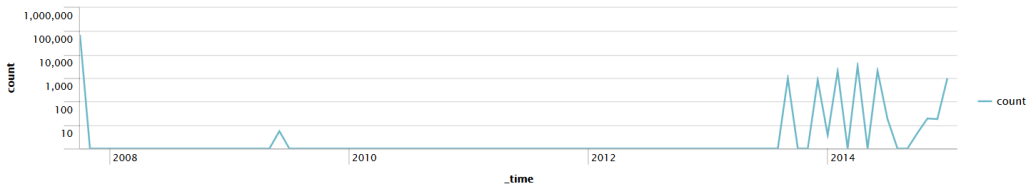
Let's see how many errors have been occurring:
sourcetype="tm1*" error | timechart count
The default chart will look something like this:
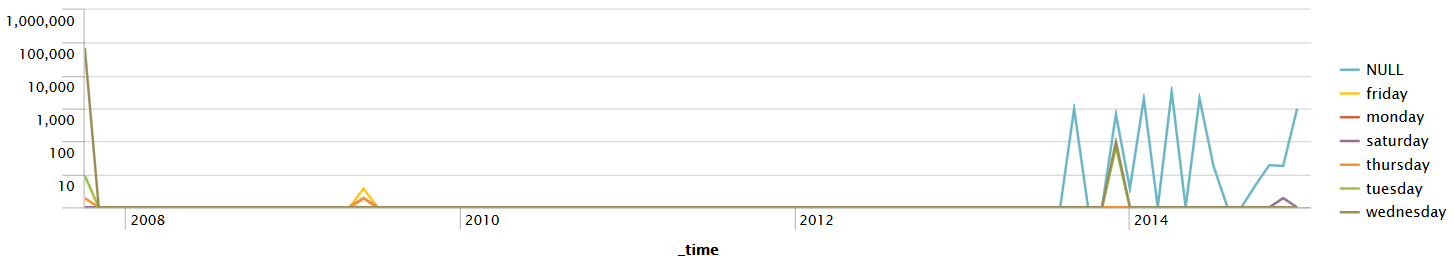
Now let's see how many errors have occurred per weekday over the same time period.
We simply need to add by user to the query:
sourcetype="tm1*" error | timechart count by date_wdayThis produces the following chart:
As we stated earlier, the x axis is always time. The y axis can be:
- One or more functions.
- A single function with a
byclause. - Multiple functions...