
Violin plots are a combined form of box plots and KDE, which offer easy-to-understand analysis of the distribution:
# Create violin plot
sns.violinplot(data=df[['satisfaction_level','last_evaluation']])

# Show figure
plt.show()
This results in the following output:
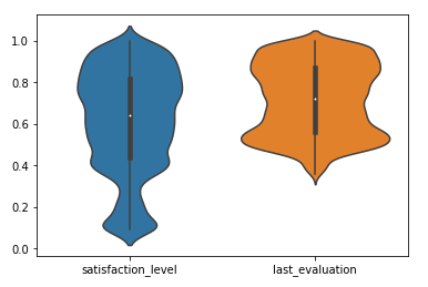
In the preceding example, we have used two variables for the violin plot. Here, we can conclude that the range of satisfaction_level is higher than last_evaluation (performance) and both the variables have two peaks in the distribution. After working on distribution plots, we will see how we can combine the groupby operation and box plot into a single plot using a count plot.