


Implementing a property pane
To get started in implementing a property pane and controlling the property values within the property pane, we must first understand the elements available in a property pane.
The property pane consists of the following three key elements:
- Pages, which are separate pages in a single property pane
- Headers, the title for the property pane
- Groups, which are sections in the property pane
Each property pane has to contain a page and at least one group. The header is always optional, as it is more or less a usability element.
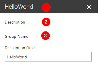
In the following screenshot, 1 is the page, 2 is the header, and 3 is the group:
Fields in property panes
Individual properties in a property pane are shown as fields. Each field has a field type, such as textbox or link.
The allowed and currently supported field types are as follows:
- Label, for text labels
- Textbox, for a single-line text entry
- Multi-line textbox, for a multi-line text entry
- Checkbox, for a single checkable item
- Dropdown, for a drop-down list...