Search icon CANCEL
Subscription
0
Cart icon
Your Cart (0 item)
Close icon
You have no products in your basket yet
Save more on your purchases! discount-offer-chevron-icon
Savings automatically calculated. No voucher code required.
Arrow left icon
All Products
Best Sellers
New Releases
Books
Videos
Audiobooks
Learning Hub
Newsletter Hub
Free Learning
Arrow right icon
timer SALE ENDS IN
0 Days
:
00 Hours
:
00 Minutes
:
00 Seconds
Arrow up icon
GO TO TOP
Mastering Data Visualization with Microsoft Visio Professional 2016

You're reading from   Mastering Data Visualization with Microsoft Visio Professional 2016 Master the art of presenting information visually using Microsoft Visio Professional 2016 and Visio Pro for Office365

Arrow left icon
Product type Paperback
Published in May 2016
Publisher Packt
ISBN-13 9781785882661
Length 334 pages
Edition 1st Edition
Arrow right icon
Author (1):
Arrow left icon
John Marshall John Marshall
Author Profile Icon John Marshall
John Marshall
Arrow right icon
View More author details
Toc

Table of Contents (17) Chapters Close

Mastering Data Visualization with Microsoft Visio Professional 2016
Credits
About the Author
www.PacktPub.com
Preface
1. Data within Visio Essentials FREE CHAPTER 2. Understanding How Data Is Stored within Visio 3. Linking Data to Shapes 4. Using the Built-In Data Graphics 5. Using the Pivot Diagram Add-On 6. Creating Custom Master Shapes 7. Creating Custom Data Graphics 8. Validating and Extracting Information 9. Automating Structured Diagrams 10. Sharing Data Diagrams 11. Choosing a Deployment Methodology Index

Overlaying linked data


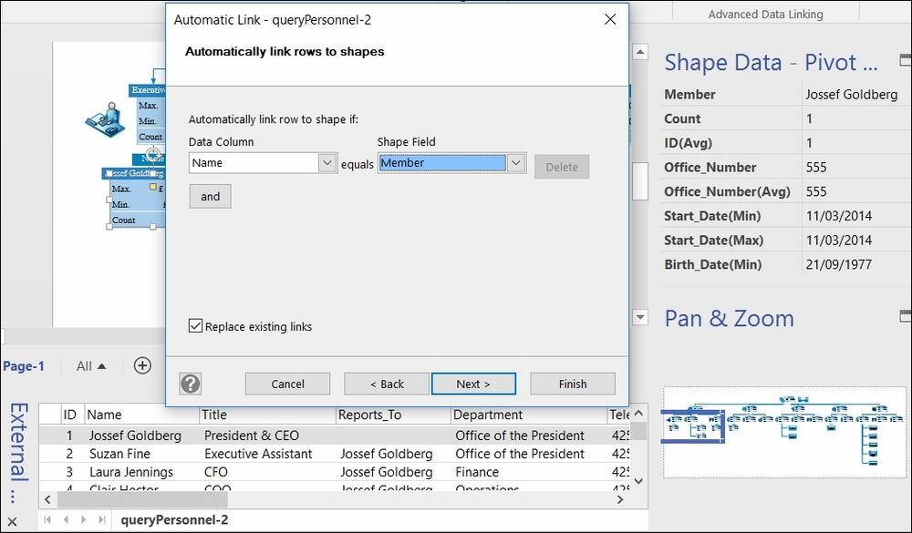
The data source for the Pivot Diagram structure may not be refreshable in SharePoint, but there is nothing to prevent some of the displayed data from being refreshable by using the Link Data feature. In the following example, the same queryPersonnel query that was used to generate the Pivot Diagram has been imported using the Data | External Data | Custom Import button. The values in the Name Data Column field are matched with the values in the Shape Field Member:

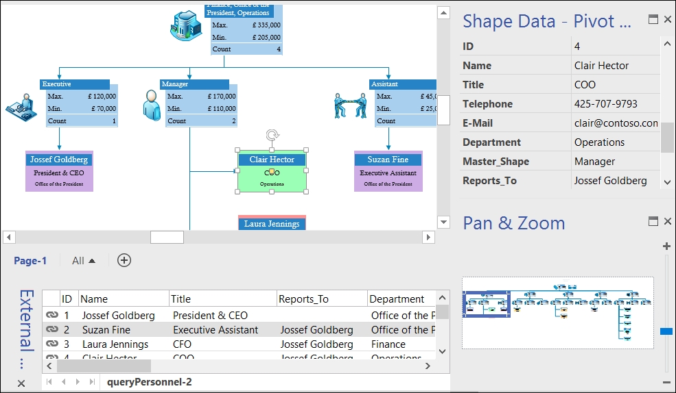
This will add the data from the matching rows to the Pivot Node shapes. These can then have a new Data Graphic applied to them, as shown in the following screenshot:

So, the Pivot Diagram add-on can be used to create the framework for a refreshable dashboard in addition to providing roll-up and aggregation of data.

Since the Pivot Breakdown and Pivot Connector shapes do not need to be displayed, the diagram does not need to look hierarchical either. The Pivot Node shapes can be arranged to suit, for example...

lock icon The rest of the chapter is locked
Register for a free Packt account to unlock a world of extra content!
A free Packt account unlocks extra newsletters, articles, discounted offers, and much more. Start advancing your knowledge today.
Unlock this book and the full library FREE for 7 days
Get unlimited access to 7000+ expert-authored eBooks and videos courses covering every tech area you can think of
Renews at $15.99/month. Cancel anytime
Visually different images