Creating time-series charts
One of the most common data visualizations is of time-series data. Visualizing a time series in pandas is as simple as calling .plot() on a DataFrame or Series object that models a time series.
The following example demonstrates creating a time series that represents a random walk of values over time, akin to the movements in the price of a stock:
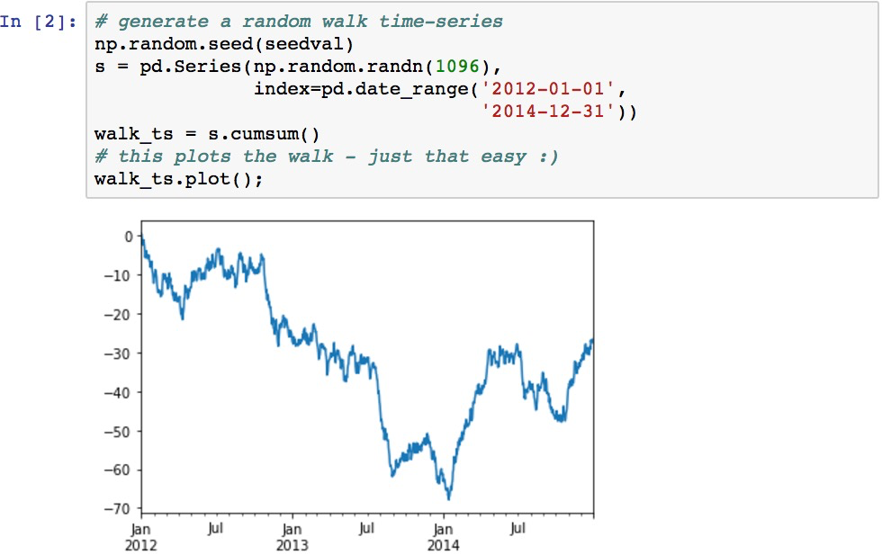
The .plot() method on pandas objects is a wrapper function around the matplotlib library's plot() function. It makes plots of pandas data very easy to create as its implementation is coded to know how to render many visualizations based on the underlying data. It handles many of the details such as selecting series, labeling, and axis generation.
In the previous example, .plot() determined that the Series contains dates for its index and therefore the x-axis should be formatted as dates. It also selects a default color for the data.
Plotting a Series of data gives a similar result as rendering a DataFrame with a single column...