Common plots used in statistical analyses
Having learned how to create, lay out, and annotate time-series charts, we will now look at creating a variety that is useful in presenting statistical information.
Showing relative differences with bar plots
Bar plots are useful in visualizing the relative differences in values of non-time-series data. Bar plots can be created by using the kind='bar' parameter of the .plot():
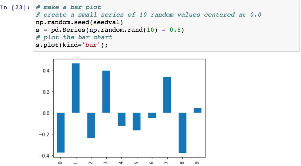
A multiple-series bar plot will be created to compare multiple values at each x-axis label:
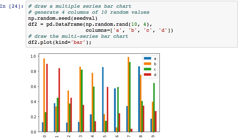
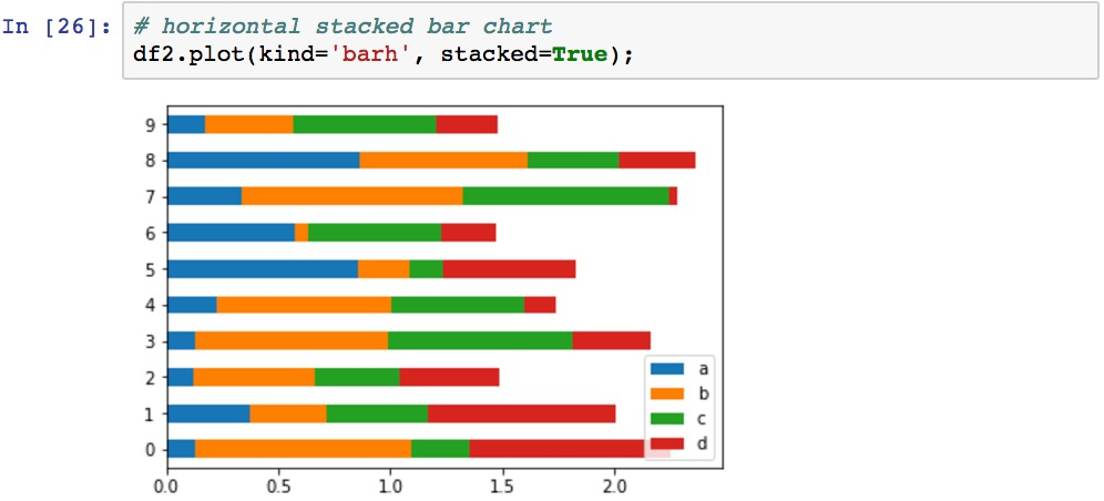
The stacked=True parameter can be use to stack the bars instead of being side by side:
The orientation can be turned to horizontal using kind='barh':
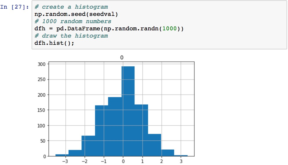
Picturing distributions of data with histograms
Histograms are useful for visualizing distributions of data. The following code generates a histogram based on 1000 random values in a normal distribution:
The resolution of a histogram can be controlled by specifying the number of bins to allocate to the graph. The default is 10, and increasing the...