Relationships between variables
The relationships between different variables can be visualized using the namespace plot from matplotlib. The scatter plot is used for visualizing relationships between two numerical variables, and the box plot is used for visualizing relationships between one numerical variable and one categorical variable. The complex conditional plot will be used to visualize many variables in a single visualization.
Scatter plot
To produce a scatter plot with pandas, all you have to do is to use the plot namespace. Within the plot namespace, you have a scatter() method and pass an x value and a y value:
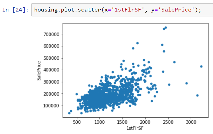
We see here that we have a positive relationship between the 1stFlrSF of the house and the SalePrice of the house. So, the 1stFlrSF variable is plotted on the x axis, the SalePrice variable on the y axis, and we can see here clearly that there is a positive relationship between these two variables; the more 1stFlrSF you have, the higher the likely sale price of the house.
...


