Geoplots
Geological plots are a great way to visualize geospatial data. Choropleth maps can be used to compare quantitative values for different countries, states, and so on. If you want to show connections between different locations, connection maps are the way to go.
Dot Map
In a dot map, each dot represents a certain number of observations. Each dot has the same size and value (the number of observations each dot represents). The dots are not meant to be counted; they are only intended to give an impression of magnitude. The size and value are important factors for the effectiveness and impression of the visualization. You can use different colors or symbols for the dots to show multiple categories or groups.
Use
To visualize geospatial data.
Example
The following diagram shows a dot map where each dot represents a certain amount of bus stops throughout the world:
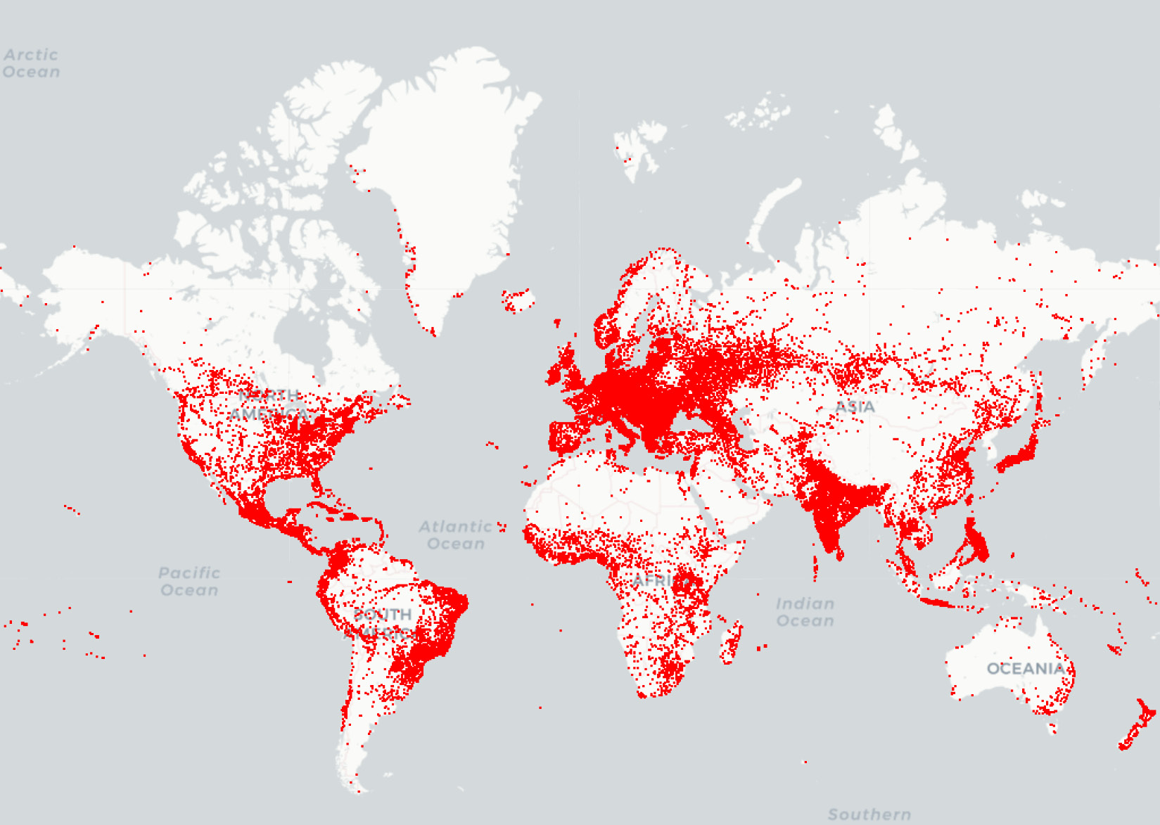
Figure 2.39: Dot map showing bus stops worldwide
Design Practices
- Do not show too many locations. You should still be able to see the map to get a feel for the actual location.
- Choose a dot size and value so that in dense areas, the dots start to blend. The dot map should give a good impression of the underlying spatial distribution.
Choropleth Map
In a choropleth map, each tile is colored to encode a variable. For example, a tile represents a geographic region for counties and countries. Choropleth maps provide a good way to show how a variable varies across a geographic area. One thing to keep in mind for choropleth maps is that the human eye naturally gives more attention to larger areas, so you might want to normalize your data by dividing the map area-wise.
Use
To visualize geospatial data grouped into geological regions—for example, states or countries.
Example
The following diagram shows a choropleth map of a weather forecast in the USA:
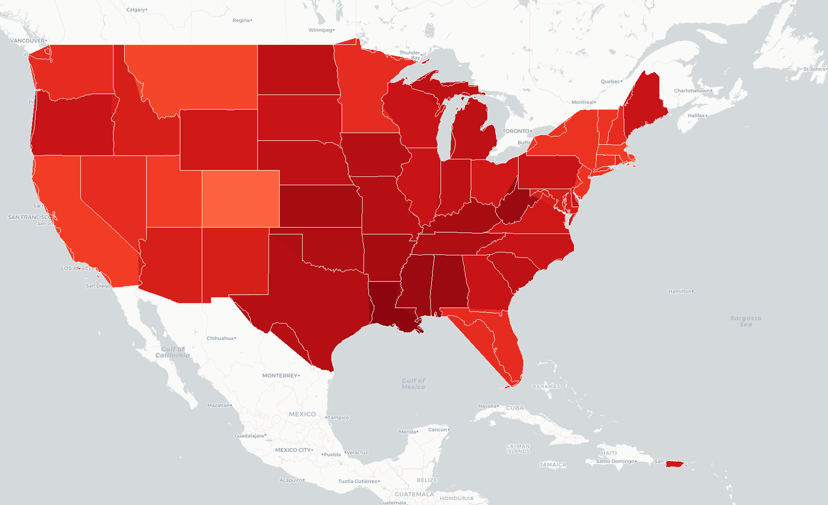
Figure 2.40: Choropleth map showing a weather forecast for the USA
Design Practices
- Use darker colors for higher values, as they are perceived as being higher in magnitude.
- Limit the color gradation, since the human eye is limited in how many colors it can easily distinguish between. Seven color gradations should be enough.
Connection Map
In a connection map, each line represents a certain number of connections between two locations. The link between the locations can be drawn with a straight or rounded line, representing the shortest distance between them.
Each line has the same thickness and value (the number of connections each line represents). The lines are not meant to be counted; they are only intended to give an impression of magnitude. The size and value of a connection line are important factors for the effectiveness and impression of the visualization.
You can use different colors for the lines to show multiple categories or groups, or you can use a colormap to encode the length of the connection.
Use
To visualize connections.
Examples
The following diagram shows a connection map of flight connections around the world:
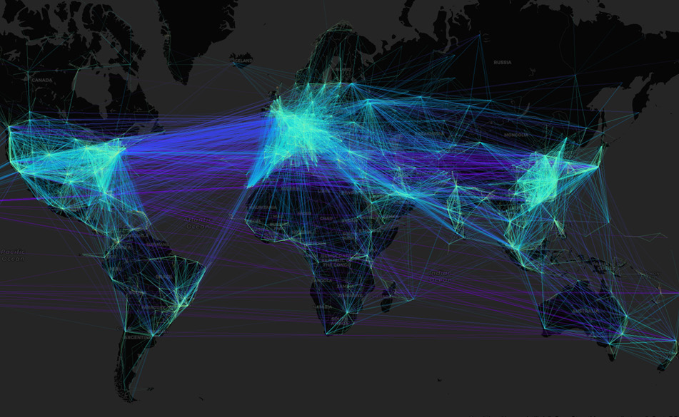
Figure 2.41: Connection map showing flight connections around the world
Design Practices
- Do not show too many connections as it will be difficult for you to analyze the data. You should still see the map to get a feel for the actual locations of the start and end points.
- Choose a line thickness and value so that the lines start to blend in dense areas. The connection map should give a good impression of the underlying spatial distribution.
Geoplots are special plots that are great for visualizing geospatial data. In the following section, we want to briefly talk about what’s generally important when it comes to creating good visualizations.