Composition Plots
Composition plots are ideal if you think about something as a part of a whole. For static data, you can use pie charts, stacked bar charts, or Venn diagrams. Pie charts or donut charts help show proportions and percentages for groups. If you need an additional dimension, stacked bar charts are great. Venn diagrams are the best way to visualize overlapping groups, where each group is represented by a circle. For data that changes over time, you can use either stacked bar charts or stacked area charts.
Pie Chart
Pie charts illustrate numerical proportions by dividing a circle into slices. Each arc length represents a proportion of a category. The full circle equates to 100%. For humans, it is easier to compare bars than arc lengths; therefore, it is recommended to use bar charts or stacked bar charts the majority of the time.
Use
To compare items that are part of a whole.
Examples
The following diagram shows household water usage around the world:
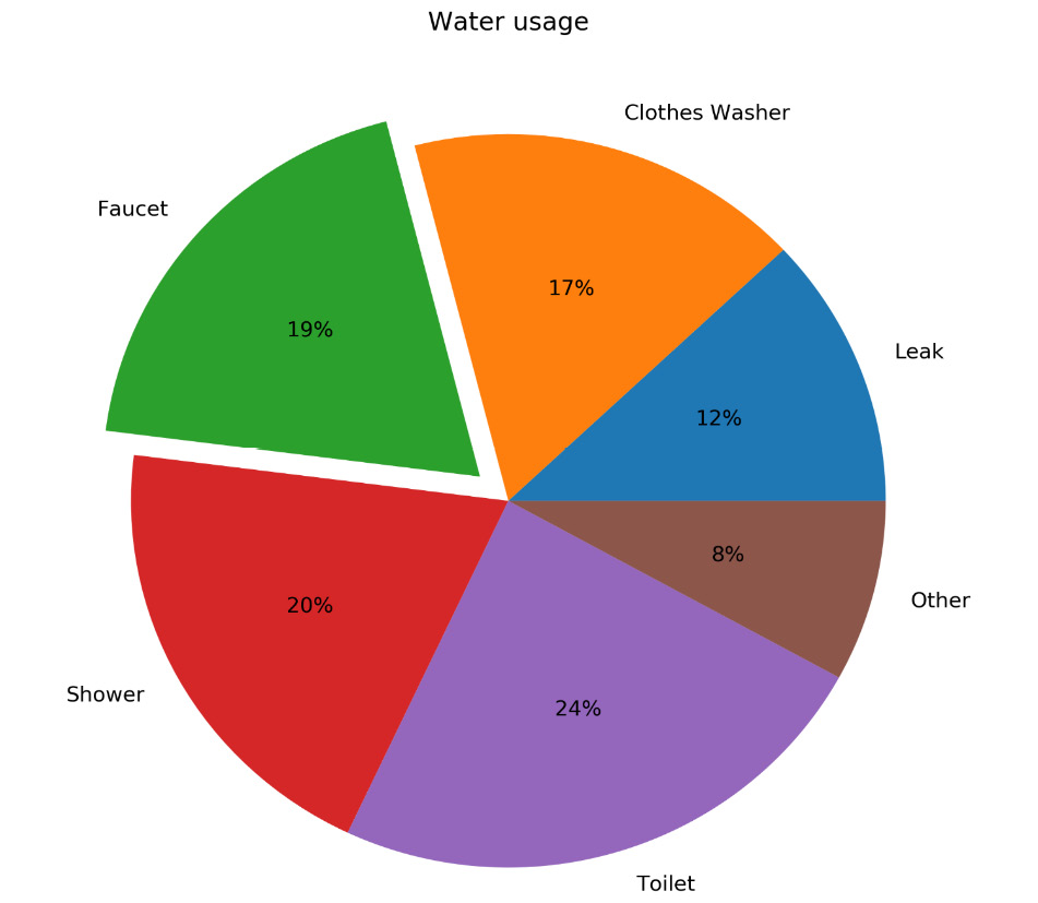
Figure 2.21: Pie chart for global household water usage
Design Practices
- Arrange the slices according to their size in increasing/decreasing order, either in a clockwise or counterclockwise manner.
- Make sure that every slice has a different color.
Variants: Donut Chart
An alternative to a pie chart is a donut chart. In contrast to pie charts, it is easier to compare the size of slices, since the reader focuses more on reading the length of the arcs instead of the area. Donut charts are also more space-efficient because the center is cut out, so it can be used to display information or further divide groups into subgroups.
The following diagram shows a basic donut chart:
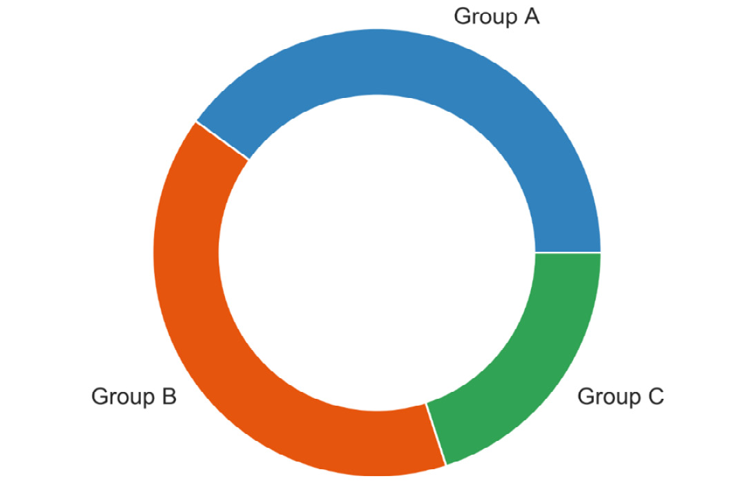
Figure 2.22: Donut chart
The following diagram shows a donut chart with subgroups:
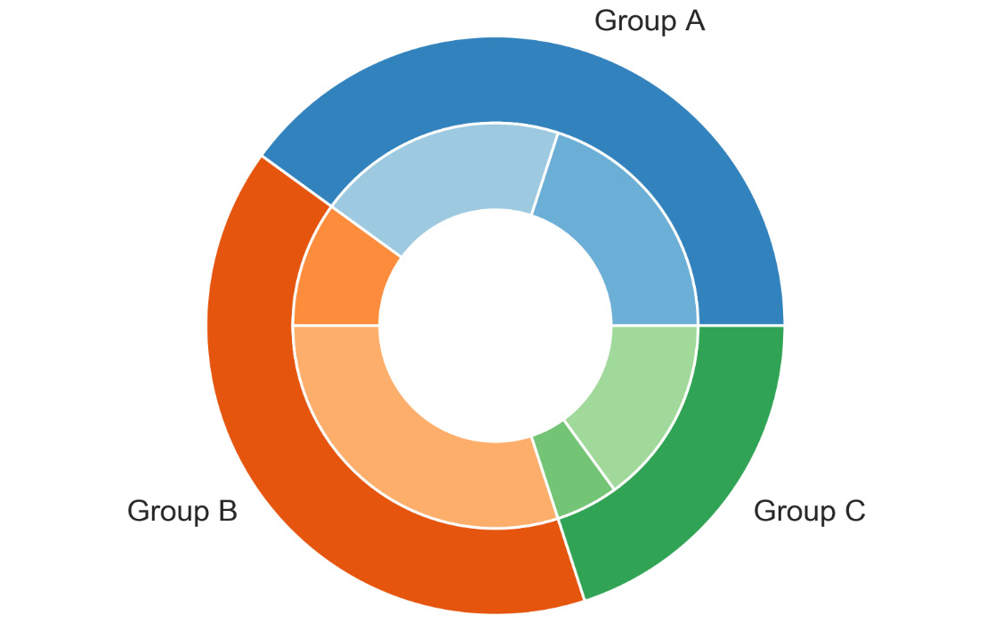
Figure 2.23: Donut chart with subgroups
Design Practice
- Use the same color that’s used for the category for the subcategories. Use varying brightness levels for the different subcategories.
Stacked Bar Chart
Stacked bar charts are used to show how a category is divided into subcategories and the proportion of the subcategory in comparison to the overall category. You can either compare total amounts across each bar or show a percentage of each group. The latter is also referred to as a 100% stacked bar chart and makes it easier to see relative differences between quantities in each group.
Use
- To compare variables that can be divided into sub-variables
Examples
The following diagram shows a generic stacked bar chart with five groups:
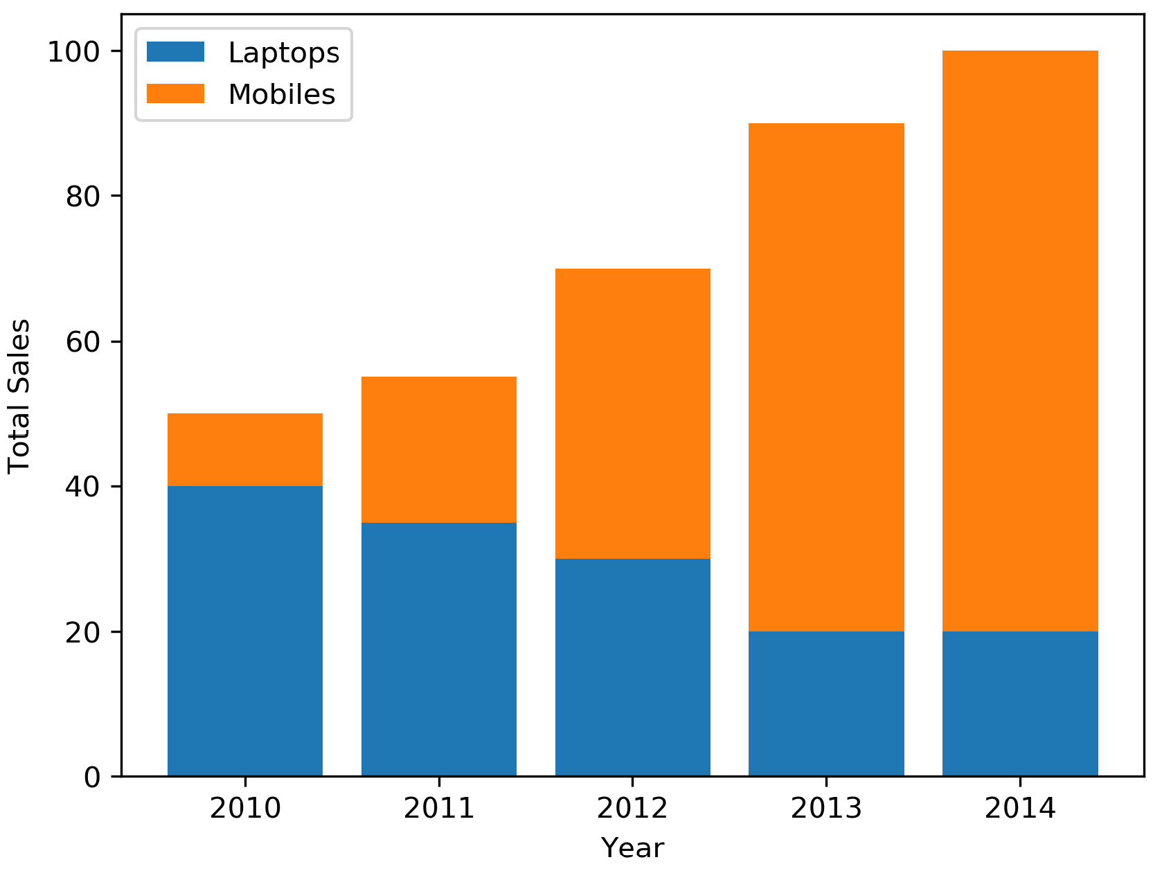
Figure 2.24: Stacked bar chart to show sales of laptops and mobiles
The following diagram shows a 100% stacked bar chart with the same data that was used in the preceding diagram:
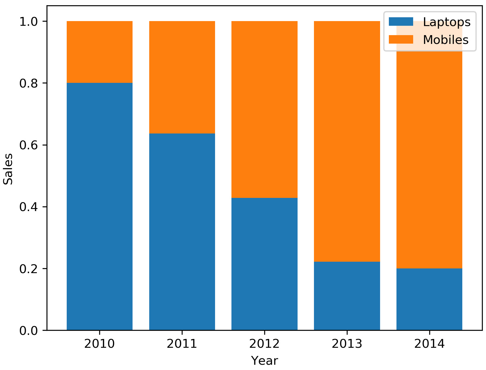
Figure 2.25: 100% stacked bar chart to show sales of laptops, PCs, and mobiles
The following diagram illustrates the daily total sales of a restaurant over several days. The daily total sales of non-smokers are stacked on top of the daily total sales of smokers:
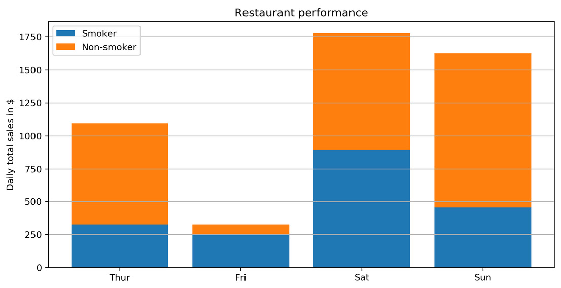
Figure 2.26: Daily total restaurant sales categorized by smokers and non-smokers
Design Practices
- Use contrasting colors for stacked bars.
- Ensure that the bars are adequately spaced to eliminate visual clutter. The ideal space guideline between each bar is half the width of a bar.
- Categorize data alphabetically, sequentially, or by value, to uniformly order it and make things easier for your audience.
Stacked Area Chart
Stacked area charts show trends for part-of-a-whole relations. The values of several groups are illustrated by stacking individual area charts on top of one another. It helps to analyze both individual and overall trend information.
Use
To show trends for time series that are part of a whole.
Examples
The following diagram shows a stacked area chart with the net profits of Google, Facebook, Twitter, and Snapchat over a decade:
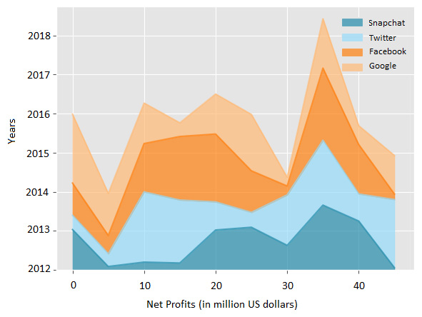
Figure 2.27: Stacked area chart to show net profits of four companies
Design Practice
- Use transparent colors to improve information visibility. This will help you to analyze the overlapping data and you will also be able to see the grid lines.
In this section, we covered various composition plots and we will conclude this section with the following activity.
Activity 2.03: Smartphone Sales Units
You want to compare smartphone sales units for the five biggest smartphone manufacturers over time and see whether there is any trend. In this activity, we also want to look at the advantages and disadvantages of stacked area charts compared to line charts:
- Looking at the following line chart, analyze the sales of each manufacturer and identify the one whose fourth-quarter performance is exceptional when compared to the third quarter.
- Analyze the performance of all manufacturers and make a prediction about two companies whose sales units will show a downward and an upward trend:
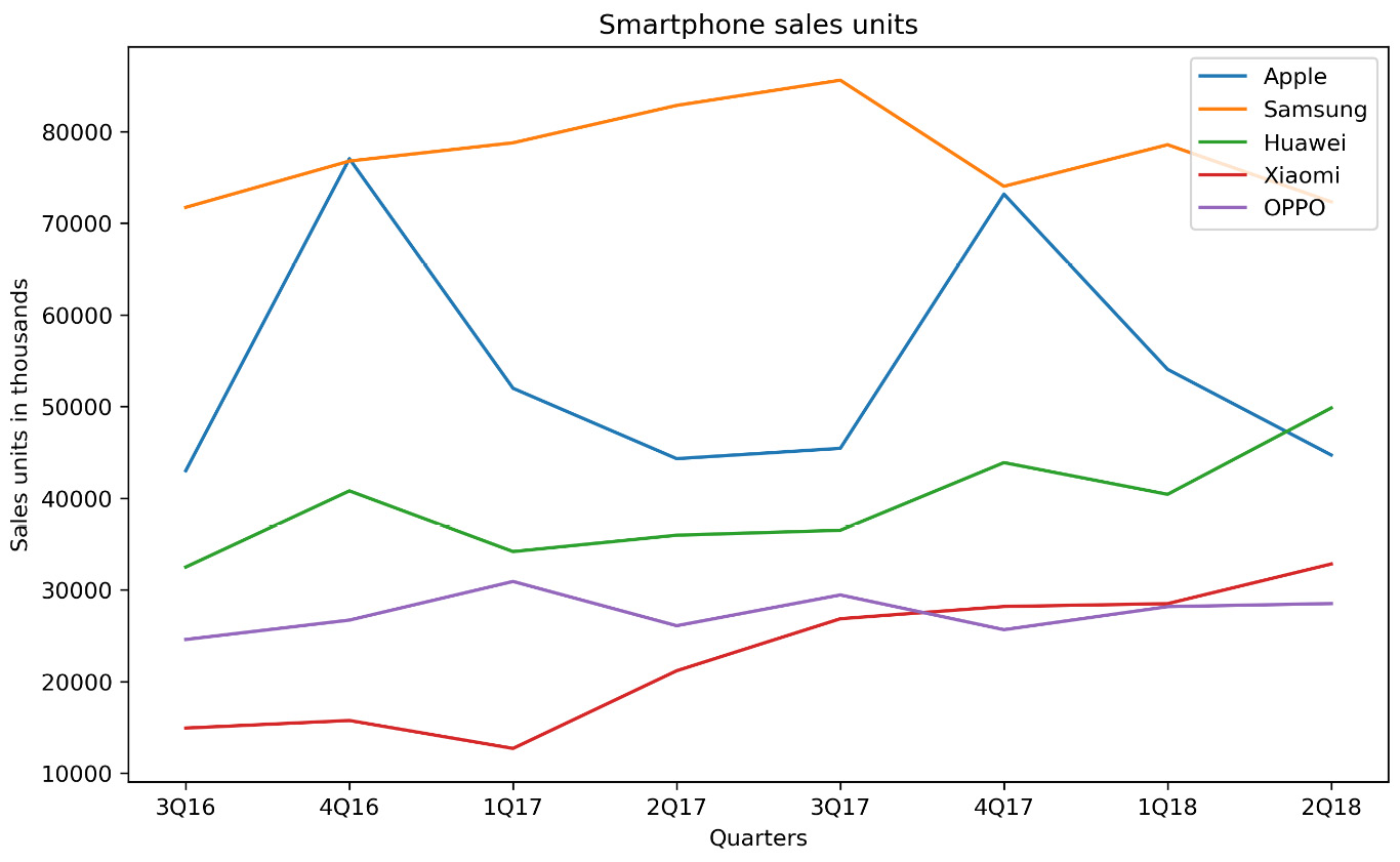
Figure 2.28: Line chart of smartphone sales units
- What would be the advantages and disadvantages of using a stacked area chart instead of a line chart?
Note
The solution for this activity can be found via this link.
Venn Diagram
Venn diagrams, also known as set diagrams, show all possible logical relations between a finite collection of different sets. Each set is represented by a circle. The circle size illustrates the importance of a group. The size of overlap represents the intersection between multiple groups.
Use
To show overlaps for different sets.
Example
Visualizing the intersection of the following diagram shows a Venn diagram for students in two groups taking the same class in a semester:
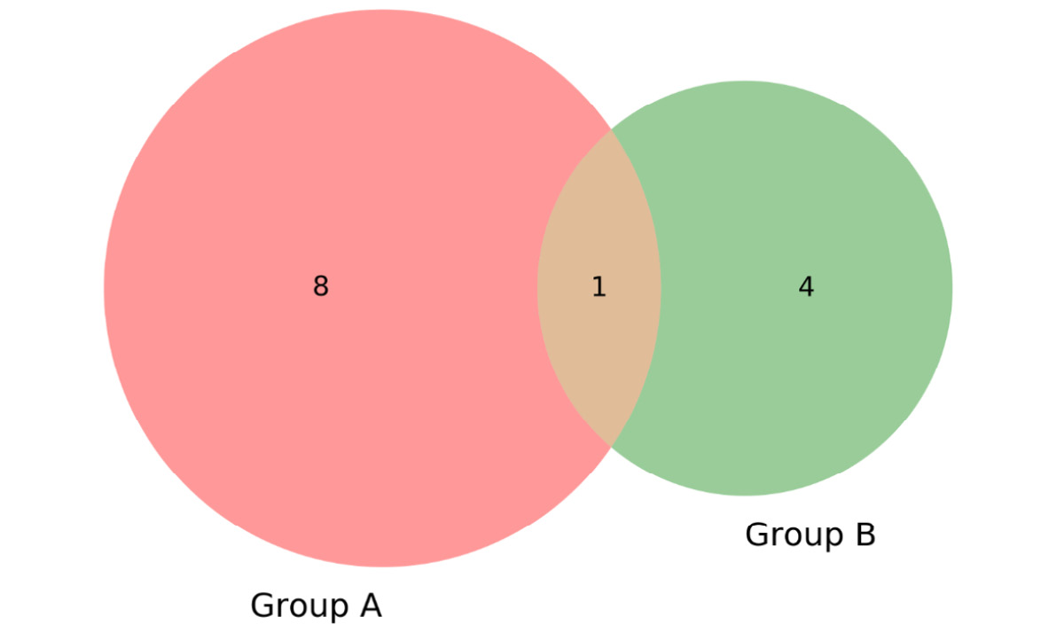
Figure 2.29: Venn diagram showing students taking the same class
From the preceding diagram, we can note that there are eight students in just group A, four students in just group B, and one student in both groups.
Design Practice
- It is not recommended to use Venn diagrams if you have more than three groups. It would become difficult to understand.
Moving on from composition plots, we will cover distribution plots in the following section.