Navigating many data points in a scatter chart
The following recipe showcases an interesting concept in the use of scatter charts in Qlik Sense. This feature is available from version 2.0+ of Qlik Sense.
Getting ready
Load the following code into your Qlik Sense application:
Transactions:
Load
 Round(1000*Rand()*Rand()*Rand()) as Sales,
 Round(10*Rand()*Rand()*Rand()) as Quantity,
 RecNo() as TransID
Autogenerate 1000000
 While rand()<0.5 or IterNo()=1;
How to do it…
- Create a new sheet and drag a
Scatter plotchart object onto the content page. - Add
TransIDas a dimension. - Add
Sum(Sales)as the first measure. Label itSales. - Add
Sum(Quantity)as the second measure. Label itQuantity. - Click on
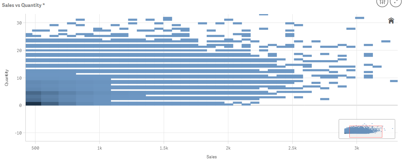
Done. - Name the chart
Sales vs Quantity. - You will notice that you cannot select data inside the chart as you can with every other Qlik Sense visualization. To navigate the data, you have to scroll in and out using the mouse wheel. The object will look like the following screenshot try scrolling in:
- As you zoom...