Plotting all the categories on one graph
Sometimes, it's nice to plot all of the lines on one graph rather having them as separate plots. To achieve this, we will alter the syntax a bit, so that the categories show up as stacked lines. Again, we can see the percentage of uninsured aligns across ages, with the under 18 group having the lowest uninsured rate, and the 25-54 group having the highest:
library(ggplot2)
### plot all on one graph

.df <- x3[order(x3$Year.1), ]
.plot <- ggplot(data = .df, aes(x = Year.1, y = Not.Covered.Pct, colour = cat,shape = cat))
+ geom_point()
+ geom_line(size = 1)
+ scale_shape_manual(values = seq(0,15))
+ ylab("Not.Covered.Pct")
+ labs(colour = "cat", shape = "cat")
+ theme_bw(base_size = 14,base_family = "serif")
print(.plot) 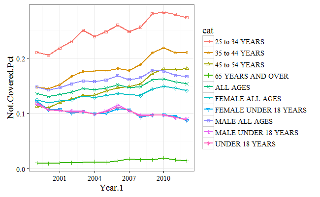
Adding labels
It can sometimes be a bit difficult to discern the differences between the categories based on the legend, especially as the number of categories increases, so we can use the directlables library to mark each line...