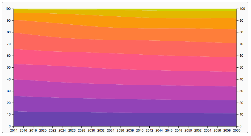
Population growth estimates using a stacked graph
For the final chart in this chapter, we're going to create a simple stacked chart, which shows the expected population growth in the US to 2060. We won't create too much interactivity or other advanced features for this graph, but will just show you how to create the following two graphs:
First, we'll create an area chart:
And then we'll use the same data to create a stacked bar chart:
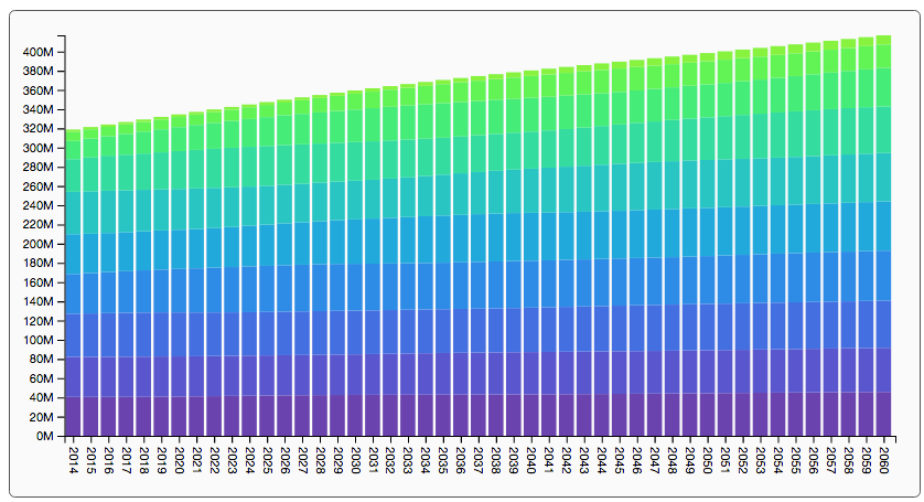
In the area chart we'll show the relative population distribution over the years, and in the bar chart, we'll show the absolute population, divided into age groups.
Getting and sanitizing the data
The US Census Bureau provides a number of files related to population growth and other projections. We'll use the CSV file you can find at this link: http://www.census.gov/population/projections/files/downloadables/NP2014_D1.csv. There is also an accompanying document explaining the file structure available, which you can download from here: http://www.census.gov/population...