XAML is also known as Extensible Application Markup Language. XAML is a generic language like XML and can be used for multiple purposes and in the WPF and Silverlight applications. XAML is majorly used to declaratively design user interfaces.
In this article by Abhishek Shukla, author of the book Blend for Visual Studio 2012 by Example Beginner's Guide, we had a look at the various layout controls and at how to use them in our application. In this article, we will have a look at the following topics:
- The fundamentals of XAML
- The use of XAML for applications in Blend
(For more resources related to this topic, see here.)
An important point to note here is that almost everything that we can do using XAML can also be done using C#. The following is the XAML and C# code to accomplish the same task of adding a rectangle within a canvas. In the XAML code, a canvas is created and an instance of a rectangle is created, which is placed inside the canvas:
- XAML code: In the following code, we declare the Rectangle element within Canvas, and that makes the Rectangle element the child of Canvas. The hierarchy of the elements defines the parent-child relationship of the elements. When we declare an element in XAML, it is the same as initializing it with a default constructor, and when we set an attribute in XAML, it is equivalent to setting the same property or event handler in code. In the following code, we set the various properties of Rectangle, such as Height, Width, and so on:
<Canvas>
   <Rectangle Height="100" Width="250" Fill="AliceBlue"
              StrokeThickness="5" Stroke="Black" />
</Canvas>
- C# code: We created Canvas and Rectangle. Then, we set a few properties of the Rectangle element and then placed Rectangle inside Canvas:
Canvas layoutRoot = new Canvas();
Rectangle rectangle = new Rectangle();

rectangle.Height = 100;
rectangle.Width = 250;
rectangle.Fill = Brushes.AliceBlue;
rectangle.StrokeThickness = 5;
rectangle.Stroke = Brushes.Black;

layoutRoot.Children.Add(rectangle);

AddChild(layoutRoot);
We can clearly see why XAML is the preferred choice to define UI elements—XAML code is shorter, more readable, and has all the advantages that a declarative language provides. Another major advantage of working with XAML rather than C# is instant design feedback. As we type XAML code, we see the changes on the art board instantly. Whereas in the case of C#, we have to run the application to see the changes. Thanks to XAML, the process of creating a UI is now more like visual design than code development.
When we drag and drop an element or draw an element on the art board, Blend generates XAML in the background. This is helpful as we do not need to hand-code XAML as we would have to when working with text-editing tools.
Generally, the order of attaching properties and event handlers is performed based on the order in which they are defined in the object element. However, this should not matter, ideally, because, as per the design guidelines, the classes should allow properties and event handlers to be specified in any order.
Wherever we create a UI, we should use XAML, and whatever relates to data should be processed in code. XAML is great for UIs that may have logic, but XAML is not intended to process data, which should be prepared in code and posted to the UI for displaying purposes. It is data processing that XAML is not designed for.
The basics of XAML
Each element in XAML maps to an instance of a .NET class, and the name of the element is exactly the same as the class. For example, the <Button> element in XAML is an instruction to create an instance of the Button class. XAML specifications define the rules to map the namespaces, types, events, and properties of object-oriented languages to XML namespaces.
Time for action – taking a look at XAML code
Perform the following steps and take a look at the XAML namespaces after creating a WPF application:
- Let's create a new WPF project in Expression Blend and name it Chapter03.
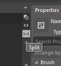
- In Blend, open MainWindow.xaml, and click on the split-view option so that we can see both the design view as well as the XAML view. The following screenshot shows this:
- You will also notice that a grid is present under the window and there is no element above the window, which means that Window is the root element for the current document. We see this in XAML, and we will also see multiple attributes set on Window:
<Window x_Class="Chapter03.MainWindow"


Title="MainWindow" Height="350" Width="525">
What just happened?
We had a look at the XAML namespaces that we use when we create a WPF application.
Time for action – adding other namespaces in XAML
In this section, we will add another namespace apart from the default namespace:
- We can use any other namespace in XAML as well. To do that, we need to declare the XML namespaces the schemas of which we want to adhere to. The syntax to do that is as follows:
Prefix is the XML prefix we want to use in our XAML to represent that namespace. For example, the XAML namespace uses the :x prefix.
Namespace is the fully qualified .NET namespace.
AssemblyName is the assembly where the type is declared, and this assembly could be the current project assembly or a referenced assembly.
- Open the XAML view of MainWindow.xaml if it is not already open, and add the following line of code after the reference to
To create an instance of an object we would have to use this namespace prefix as
<system:Double></system:Double>
- We can access the types defined in the current assembly by referencing the namespace of the current project:
To create an instance of an object we would have to use this namespace prefix as

<local:MyObj></local:MyObj>
What just happened?
We saw how we can add more namespaces in XAML apart from the ones present by default and how we can use them to create objects.
Naming elements
In XAML, it is not mandatory to add a name to every element, but we might want to name some of the XAML elements that we want to access in the code or XAML. We can change properties or attach the event handler to, or detach it from, elements on the fly.
We can set the name property by hand-coding in XAML or setting it in the properties window. This is shown in the following screenshot:

The code-behind class
The x:Class attribute in XAML references the code-behind class for XAML. You would notice the x:, which means that the Class attribute comes from the XAML namespace, as discussed earlier. The value of the attribute references the MainWindow class in the Chapter03 namespace. If we go to the MainWindow.xaml.cs file, we can see the partial class defined there. The code-behind class is where we can put C# (or VB) code for the implementation of event handlers and other application logic. As we discussed earlier, it is technically possible to create all of the XAML elements in code, but that bypasses the advantages of having XAML.
So, as these two are partial classes, they are compiled into one class. So, as C# and XAML are equivalent and both these are partial classes, they are compiled into the same IL.
Time for action – using a named element in a code-behind class
- Go to MainWindow.xaml.cs and change the background of the LayoutRoot grid to Green:
public MainWindow()
{
   InitializeComponent();
   LayoutRoot.Background = Brushes.Green;
}
- Run the application; you will see that the background color of the grid is green.
What just happened?
We accessed the element defined in XAML by its name.
Unlock access to the largest independent learning library in Tech for FREE!
Get unlimited access to 7500+ expert-authored eBooks and video courses covering every tech area you can think of.
Renews at $15.99/month. Cancel anytime
Default properties
The content of a XAML element is the value that we can simply put between the tags without any specific references. For example, we can set the content of a button as follows:
<Button Content="Some text" /> or <Button > Some text </Button>
The default properties are specified in the help file. So, all we need to do is press F1 on any of our controls to see what the value is.
Expressing properties as attributes
We can express the properties of an element as an XML attribute.
Time for action – adding elements in XAML by hand-coding
In this section, instead of dragging and dropping controls, we will add XAML code:
- Move MainWindow.xaml to XAML and add the code shown here to add TextBlock and three buttons in Grid:
<Grid x_Name="LayoutRoot">
<TextBlock Text="00:00" Height="170" Margin="49,32,38,116" Width="429" FontSize="48"/>
   <Button Content="Start" Height="50" Margin="49,220,342,49"     Width="125"/>
   <Button Content="Stop" Height="50" Margin="203,220,188,49"     Width="125"/>
   <Button Content="Reset" Height="50" Margin="353,220,38,49"
   Width="125"/>
</Grid>

- We set a few properties for each of the elements. The property types of the various properties are also mentioned. These are the .NET types to which the type converter would convert them:
- Content: This is the content displayed onscreen. This property is of the Object type.
- Height: This is the height of the button. This property is of the Double type.
- Width: This is the width of the button. This property is of the Double type.
- Margin: This is the amount of space outside the control, that is, between the edge of the control and its container. This property is of the Thickness type.
- Text: This is the text displayed onscreen. This property is of the String type.
- FontSize: This is the size of the font of the text. This property is of the Double type.
What just happened?
We added elements in XAML with properties as XML attributes.
Non-attribute syntax
We will define a gradient background for the grid, which is a complex property. Notice that the code in the next section sets the background property of the grid using a different type converter this time. Instead of a string-to-brush converter, the LinearGradientBrush to brush type converter would be used.
Time for action – defining the gradient for the grid
- Add the following code inside the grid.
- We have specified two gradient stops. The first one is black and the second one is a shade of green.
- We have specified the starting point of LinearGradientBrush as the top-left corner and the ending point as the bottom-right corner, so we will see a diagonal gradient:
<Grid x_Name="LayoutRoot">
<Grid.Background>
   <LinearGradientBrush EndPoint="1,1" StartPoint="0,0">
     <GradientStop Color="Black"/>
     <GradientStop Color="#FF27EC07" Offset="1"/>
   </LinearGradientBrush>
</Grid.Background>
The following is the output of the preceding code:

Comments in XAML
Using <!-- --> tags, we can add comments in XAML just as we add comments in XML. Comments are really useful when we have complex XAML with lots of elements and complex layouts:
<!-- TextBlock to show the timer -->
Styles in XAML
We would like all the buttons in our application to look the same, and we can achieve this using styles. Here, we will just see how styles can be defined and used in XAML.
Defining a style
We will define a style as a static resource in the window. We can move all the properties we define for each button to that style.
Time for action – defining style in XAML
Add a new <Window.Resources> tag in XAML, and then add the code for the style, as shown here:
<Window.Resources>
<Style TargetType="Button" x_Key="MyButtonStyle">
   <Setter Property="Height" Value="50" />
   <Setter Property="Width" Value="125" />
   <Setter Property="Margin" Value="0,10" />
   <Setter Property="FontSize" Value="18"/>
   <Setter Property="FontWeight" Value="Bold" />
   <Setter Property="Background" Value="Black" />
   <Setter Property="Foreground" Value="Green" />
</Style>
</Window.Resources>
We defined a few properties on style that are worth noting:
- TargetType: This property specifies the type of element to which we will apply this style. In our case, it is Button.
- x:Key: This is the unique key to reference the style within the window.
- Setter: The setter elements contain the property name and value.
What just happened
We defined a style for a button in the window.
Using a style
Let's use the style that we defined in the previous section. All UI controls have a style property (from the FrameworkElement base class).
Time for action – defining style in XAML
- To use a style, we have to set the style property of the element as shown in the following code. Add the same style code to all the buttons:
The following is the output of the preceding code:

What just happened?
We used a style defined for a button.
Where to go from here
This article gave a brief overview of XAML, which helps you to start designing your applications in Expression Blend. However, if you wish know more about XAML, you could visit the following MSDN links and go through the various XAML specifications and details:
- XAML in Silverlight: http://msdn.microsoft.com/en-us/library/cc189054(v=vs.95).aspx
- XAML in WPF: http://msdn.microsoft.com/en-us/library/ms747122(v=vs.110).aspx
Pop quiz
Q1. How can we find out the default property of a control?
- F1.
- F2.
- F3.
- F4.
Q2. Is it possible to create a custom type converter?
- Yes.
- No.
Summary
We had a look at the basics of XAML, including namespaces, elements, and properties. With this introduction, you can now hand-edit XAML, where necessary, and this will allow you to tweak the output of Expression Blend or even hand-code an entire UI if you are more comfortable with that.
Resources for Article:
Further resources on this subject:

 United States
 Great Britain
 India
India
 Germany
 France
 Canada
 Russia
 Spain
Spain
 Brazil
 Australia
 South Africa
 Thailand
 Ukraine
 Switzerland
 Slovakia
 Luxembourg
 Hungary
 Romania
 Denmark
 Ireland
 Estonia
 Belgium
 Italy
Italy
 Finland
 Cyprus
 Lithuania
 Latvia
 Malta
Malta
 Netherlands
 Portugal
 Slovenia
 Sweden
 Argentina
 Colombia
 Ecuador
 Indonesia
 Mexico
 New Zealand
 Norway
 South Korea
 Taiwan
 Turkey
 Czechia
 Austria
 Greece
 Isle of Man
 Bulgaria
 Japan
Japan
 Philippines
 Poland
 Singapore
 Egypt
Egypt
 Chile
Chile
 Malaysia


