Over 90 simple and incredibly effective recipes for transforming your business data into exciting dashboards with SAP BusinessObjects Dashboards 4.0 Xcelsius
Introduction
In this article, we will go through certain techniques on how you can utilize the different cosmetic features Dashboard Design provides, in order to improve the look of your dashboard. Dashboard Design provides a powerful way to capture the audience versus other dashboard tools. It allows developers to build dashboards with the important 'wow' factor that other tools lack. Let's take, for example, two dashboards that have the exact same functionality, placement of charts, and others. However, one dashboard looks much more attractive than the other. In general, people looking at the nicer looking dashboard will be more interested and thus get more value of the data that comes out of it.
Thus, not only does Dashboard Design provide a powerful and flexible way of presenting data, but it also provides the 'wow' factor to capture a user's interest.
Changing the look of a chart
This recipe will run through changing the look of a chart. Particularly, it will go through each tab in the appearance icon of the chart properties. We will then make modifications and see the resulting changes.
Getting ready
Insert a chart object onto the canvas. Prepare some data and bind it to the chart.
How to do it...
- Double-click/right-click on the chart object on the canvas/object properties window to go into Chart Properties.
- In the Layout tab, uncheck Show Chart Background.

(Move the mouse over the image to enlarge.)
- In the Series tab, click on the colored square box circled in the next screenshot to change the color of the bar to your desired color.
- Then change the width of each bar; click on the Marker Size area and change it to 35.

- Click on the colored boxes circled in red in the Axes tab and choose dark blue to modify the horizontal and vertical axes separately.
- Uncheck Show Minor Gridlines at the bottom so that we remove all the horizontal lines in between each of the major gridlines.

- Next, go to the Text and Color tabs, where you can make changes to all the different text areas of the chart.

Unlock access to the largest independent learning library in Tech for FREE!
Get unlimited access to 7500+ expert-authored eBooks and video courses covering every tech area you can think of.
Renews at $15.99/month. Cancel anytime
How it works...
As you can see, the default chart looks plain and the bars are skinny so it's harder to visualize things. It is a good idea to remove the chart background if there is an underlying background so that the chart blends in better. In addition, the changes to the chart colors and text provide additional aesthetics that help improve the look of the chart.
Adding a background to your dashboard
This recipe shows the usefulness of backgrounds in the dashboard. It will show how backgrounds can help provide additional depth to objects and help to group certain areas together for better visualization.
Getting ready
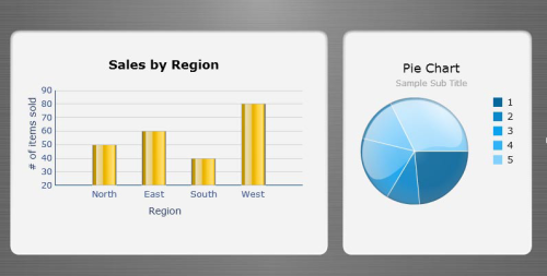
Make sure you have all your objects such as charts and selectors ready on the canvas. Here's an example of the two charts before the makeover. Bind some data to the charts if you want to change the coloring of the series

How to do it...
- Choose Background4 from the Art and Backgrounds tab of the Components window.

- Stretch the background so that it fills the size of the canvas.
- Make sure that ordering of the backgrounds is before the charts. To change the ordering of the background, go to the object browser, select the background object and then press the "-" key until the background object is behind the chart.
- Select Background1 from the Art and Backgrounds tab and put two of them under the charts, as shown in the following screenshot:

- When the backgrounds are in the proper place, open the properties window for the backgrounds and set the background color to your desired color. In this example we picked turquoise blue for each background.
How it works...
As you can see with the before and after pictures, having backgrounds can make a huge difference in terms of aesthetics. The objects are much more pleasant to look at now and there is certainly a lot of depth with the charts.
The best way to choose the right backgrounds that fit your dashboard is to play around with the different background objects and their colors. If you are not very artistic, you can come up with a bunch of examples and demonstrate it to the business user to see which one they prefer the most.
 United States
 Great Britain
 India
India
 Germany
 France
 Canada
 Russia
 Spain
Spain
 Brazil
 Australia
 South Africa
 Thailand
 Ukraine
 Switzerland
 Slovakia
 Luxembourg
 Hungary
 Romania
 Denmark
 Ireland
 Estonia
 Belgium
 Italy
Italy
 Finland
 Cyprus
 Lithuania
 Latvia
 Malta
Malta
 Netherlands
 Portugal
 Slovenia
 Sweden
 Argentina
 Colombia
 Ecuador
 Indonesia
 Mexico
 New Zealand
 Norway
 South Korea
 Taiwan
 Turkey
 Czechia
 Austria
 Greece
 Isle of Man
 Bulgaria
 Japan
Japan
 Philippines
 Poland
 Singapore
 Egypt
Egypt
 Chile
Chile
 Malaysia


