There are three main types of Moodle pages to consider when it comes to design:
- Moodle front pages
- Moodle course pages
- Moodle activities
Before we go into detail about design considerations, let's look at examples of each of these to see how we can improve them with a few basic steps.
Moodle front page
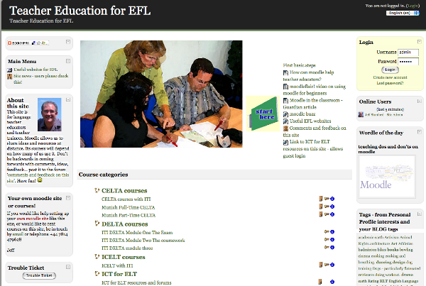
If we take Moodle straight out of the box, set up some blocks for the main menu, provide some useful links, and set the front page settings to show a list of courses, we could have something like this:
BEFORE

It's functional enough, but not very engaging. Just by making a few changes, we can make the front page much more interesting and readable:
AFTER

What's changed?
- There's a new theme (Moodle speak for the color scheme and automatic font choices). As we'll see in a bit, some themes also include tabs and drop-down menus.
- There's an appropriate image in the top-center of the screen to draw users in.
- The About this site block has a photo of the administrator, which provides a personal touch.
- There's an easily-identifiable "start here icon"—another helpful feature that guides your users in the right direction.
Moodle course page
Like the Moodle front page, a standard course page automatically creates three columns for us to fill with text. If we choose a topics format from the Settings menu and write out a list of activities and links for our course, it could look something like this:
BEFORE

The problem here is that it's difficult to distinguish important information from unimportant information. There's a lot of scrolling to be done, and there are no visual clues as to what the course page is about. Here's one way of transforming the page:
AFTER

What's changed?
- There's a new theme.
- The theme includes tabs with links to key parts of the site.
- There's an image related to the course topic (teaching) at the top of the course page.
- The long list in the previous version has been reduced to a more manageable size.
- Important information is at the top of the page, and is in a larger font size. It contrasts with less important information, which has a smaller font size.
- Lines are used to separate different sorts of information.
- There is more color harmony—at attempt to get the colors to blend.
- There's an avatar introduction in the left block for new users.
Moodle activity
When we're pushed for time, it's all too tempting just to set out a list of references without paying due attention to instructions and a helpful hierarchy of information, as in the following example:
BEFORE

There's a lot of information here. We can use the Book module to organize the information, and make the page more readable, as in the following transformation:
AFTER

What's changed?
- The previous list has been divided into sections in the Book module
- There's a "how-to" section at the beginning of the Table of Contents
- Graphics from the target websites have been included as visual clues
- The Tool labels such as Audacity and Findsounds are in a larger font size to make them stand out
- An action girl icon indicates task instructions
- Task instructions are in bold blue to make them stand out
- A grid is used to separate sections
As we can see, by enhancing the visual design of our sites we can make our materials more engaging and effective. We can also make them more attractive by improving the quality of the audio, images, and video that we use. Here are some principles we could take on board:
Contrast
Consider hierarchies of importance in your materials. The default font size on HTML pages is 12 points, similar to what you're reading now. Vary the size to make more important information stand out. You can also use images, buttons, and navigation signs to help users see the function of pages and content more quickly and remember it.
Consistency
Being consistent in your use of fonts for certain sorts of information, font sizes for ranking information, and navigation links will make it easier for users to understand the site and will make it more aesthetically pleasing. It's also better not to use too many different fonts or make your site too fancy or you will end up with a dog's breakfast. As a rule, it'll look better if you use different sizes of a limited number of fonts, rather than including lots of different fonts.
To promote design consistency on your Moodle site, consider setting up a style guide so that all teachers use the same design framework.
Alignment
A basic principle of graphic design is to make sure that the objects on your page are aligned with each other. Imagine a grid that they stick to. Aligned objects look more professional and enhance contrast within pages. Moodle organizes that automatically for us with front pages and course pages, but when we set up instruction pages for activities, we need to keep alignment principles in mind, as we have more design freedom.
Quality
Aim for the best quality audio recordings and images. It is likely to make a big difference to language learners if they can listen to clear recordings and easily identify the content of images.
This article
Each of the following sections in this article contributes to the above principles by demonstrating some of the tools available in Moodle that help you with your design. You'll find a consideration of these and other website design issues at http://www.asktog.com/basics/firstPrinciples.html.
Unlock access to the largest independent learning library in Tech for FREE!
Get unlimited access to 7500+ expert-authored eBooks and video courses covering every tech area you can think of.
Renews at $15.99/month. Cancel anytime
Here are the main topics covered in this article:
- Text
- Images
- Videos
- Sound
- Navigation
- Blocks
- Layout
- Style guide
- Accessibility
- Feedback
Text
There are two main ways of entering text in Moodle:
- Adding text pages
- Adding web pages using the HTML editor
The most common way is by using the HTML editor. Most of this section on text will look at formatting options using that.
Adding text pages
When you select Add a resource... and then Compose a text page, you get a choice of formatting options for your page.

You might find it useful to use the Moodle auto-format, as it automatically creates emoticons, paragraphs, and hyperlinks for you if you write in web addresses. Creating hyperlinks is a little more time-consuming if you choose the HTML format, as you have to create all hyperlinks manually. Markdown format is also useful if you want to create a structured document with lists and emphasis. You can, of course, produce all these in the HTML format, using the editing menu. The following options are available when you select Add a resource... and then Compose a text page.
|
Formatting options
|
Details
|
|
Moodle auto-format
|
This has limited formatting options, but will automatically turn URLs like http://moodle.org into hyperlinks and will include emoticons like J when you type :). It keeps line breaks and converts blank lines into new paragraphs.
|
|
HTML format
|
This does not automatically format text, but gives you a wide range of possibilities for editing your text. It allows you to change font faces, font sizes, and color, as well as embed graphic images, sound, and video. Note that if you select Compose a text page and then the HTML format option, you will need to enter pure HTML-that's the code that produces web pages.
If you are not familiar with HTML, you'll be better off choosing Compose a web page and then using the HTML graphic editor.
|
|
Plain text format
|
This format keeps spaces and new lines, but no other formatting is available.
|
|
Markdown format
|
Markdown allows you to easily add emphasis (bold, italics), structure (bullet points and headings), and links (to images or other web resources). You can use Markdown in many places in Moodle. Simply select it from the formatting drop-down list, which is found below the text entry area, wherever you have the choice.
|
 United States
 Great Britain
 India
India
 Germany
 France
 Canada
 Russia
 Spain
Spain
 Brazil
 Australia
 South Africa
 Thailand
 Ukraine
 Switzerland
 Slovakia
 Luxembourg
 Hungary
 Romania
 Denmark
 Ireland
 Estonia
 Belgium
 Italy
Italy
 Finland
 Cyprus
 Lithuania
 Latvia
 Malta
Malta
 Netherlands
 Portugal
 Slovenia
 Sweden
 Argentina
 Colombia
 Ecuador
 Indonesia
 Mexico
 New Zealand
 Norway
 South Korea
 Taiwan
 Turkey
 Czechia
 Austria
 Greece
 Isle of Man
 Bulgaria
 Japan
Japan
 Philippines
 Poland
 Singapore
 Egypt
Egypt
 Chile
Chile
 Malaysia


