What Makes a Good Visualization?
There are multiple aspects to what makes a good visualization:
- Most importantly, the visualization should be self-explanatory and visually appealing. To make it self-explanatory, use a legend, descriptive labels for your x-axis and y-axis, and titles.
- A visualization should tell a story and be designed for your audience. Before creating your visualization, think about your target audience; create simple visualizations for a non-specialist audience and more technical detailed visualizations for a specialist audience. Think about a story to tell with your visualization so that your visualization leaves an impression on the audience.
Common Design Practices
- Use colors to differentiate variables/subjects rather than symbols, as colors are more perceptible.
- To show additional variables on a 2D plot, use color, shape, and size.
- Keep it simple and don’t overload the visualization with too much information.
Activity 2.05: Analyzing Visualizations
The following visualizations are not ideal as they do not represent data well. Answer the following questions for each visualization. The aim of this activity is to sharpen your skills with regard to choosing the best suitable plot for a scenario.
- What are the bad aspects of these visualizations?
- How could we improve the visualizations? Sketch the right visualization for both scenarios.
The first visualization is supposed to illustrate the top 30 YouTube music channels according to their number of subscribers:
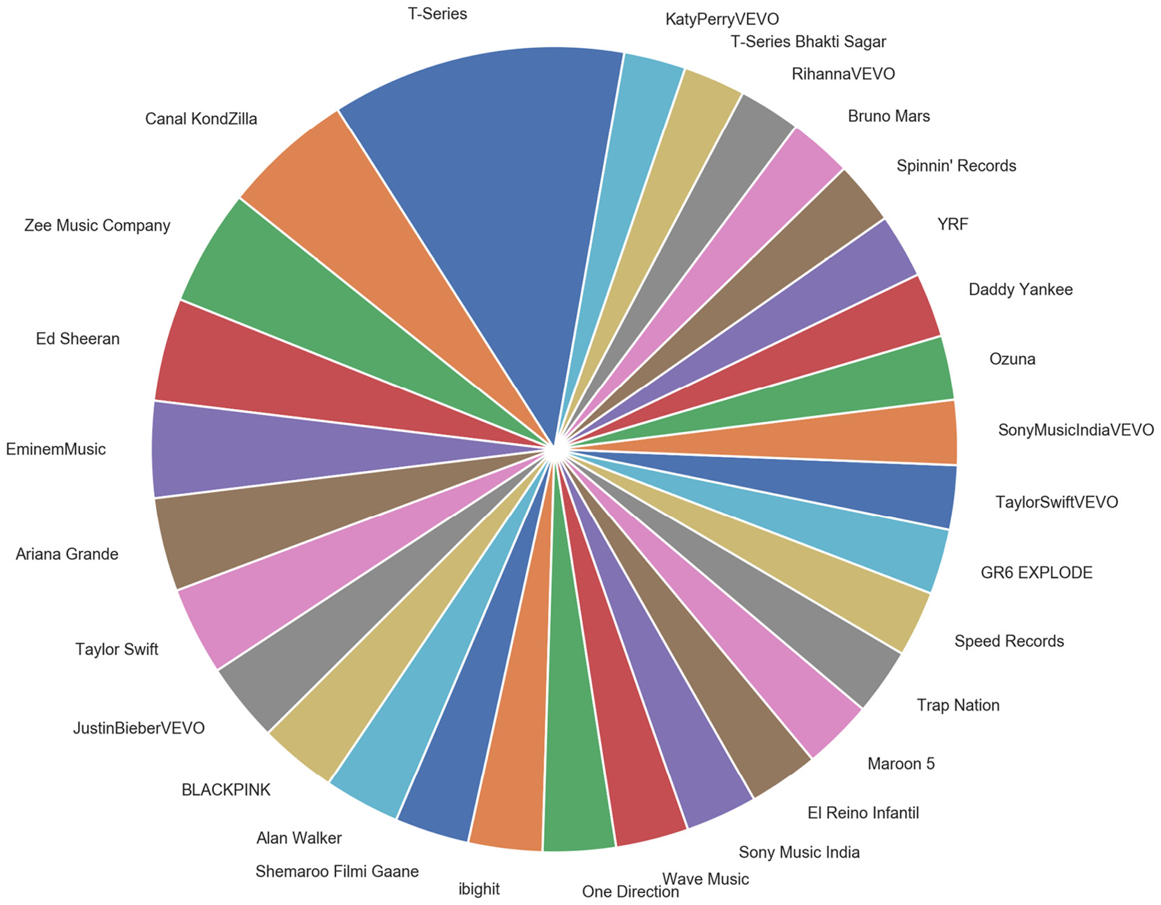
Figure 2.42: Pie chart showing the top 30 YouTube music channels
The second visualization is supposed to illustrate the number of people playing a certain game in a casino over 2 days:
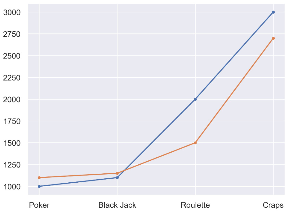
Figure 2.43: Line chart displaying casino data for 2 days
Note
The solution for this activity can be found via this link.
Activity 2.06: Choosing a Suitable Visualization
In this activity, we are using a dataset to visualize the median, the interquartile ranges, and the underlying density of populations from different income groups. Following is the link to the dataset that we have used: https://population.un.org/wpp/Download/Files/1_Indicators%20(Standard)/EXCEL_FILES/1_Population/WPP2019_POP_F07_1_POPULATION_BY_AGE_BOTH_SEXES.xlsx. Select the best suitable plot from the following plots.
The following diagram shows the population by different income groups using a density plot:
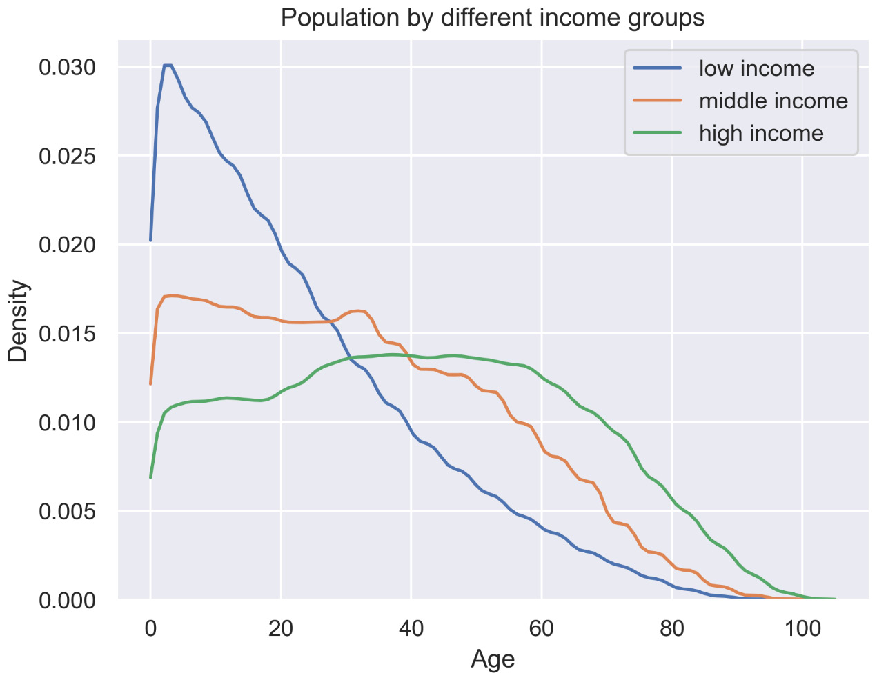
Figure 2.44: Density plot
The following diagram shows the population by different income groups using a box plot:
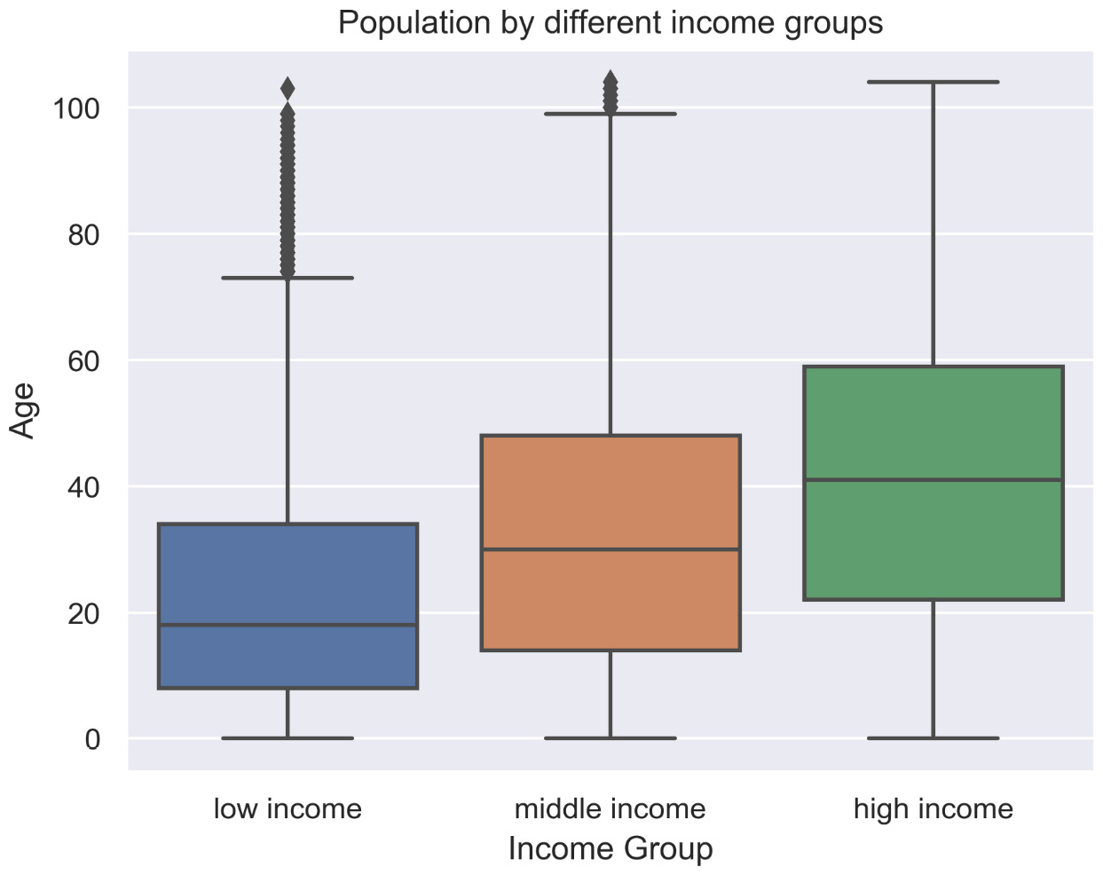
Figure 2.45: Box plot
The following diagram shows the population by different income groups using a violin plot:
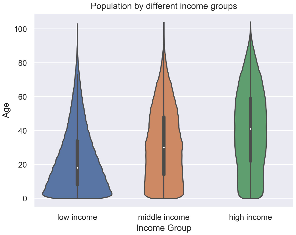
Figure 2.46: Violin plot
Note
The solution for this activity can be found via this link.