In this article by John Farrar, author of the book KnockoutJS Web development, we will see how templates drove us to a more dynamic, creative platform. The next advancement in web development was custom HTML components. KnockoutJS allows us to jump right in with some game-changing elegance for designers and developers. In this article, we will focus on:
- An introduction to components
- Bring Your Own Tags (BYOT)
- Enhancing attribute handling
- Making your own libraries
- Asynchronous module definition (AMD)—on demand resource loading
This entire article is about packaging your code for reuse. Using these techniques, you can make your code more approachable and elegant.
(For more resources related to this topic, see here.)
Introduction to components
The best explanation of a component is a packaged template with an isolated ViewModel. Here is the syntax we would use to declare a like component on the page:
<div data-bind="component: "like"''"></div>
If you are passing no parameters through to the component, this is the correct syntax. If you wish to pass parameters through, you would use a JSON style structure as follows:
<div data-bind="component:
{name: 'like-widget',params:{ approve: like} }"></div>
This would allow us to pass named parameters through to our custom component. In this case, we are passing a parameter named approve. This would mean we had a bound viewModel variable by the name of like. Look at how this would be coded. Create a page called components.html using the _base.html file to speed things up as we have done in all our other articles. In your script section, create the following ViewModel:
<script>
ViewModel = function(){
self = this;
self.like = ko.observable(true);
}
;
// insert custom component here
vm = new ViewModel();
ko.applyBindings(vm);
</script>
Now, we will create our custom component. Here is the basic component we will use for this first component. Place the code where the comment is, as we want to make sure it is added before our applyBindings method is executed:
ko.components.register('like-widget', {
viewModel: function(params) {
   this.approve = params.approve;
   // Behaviors:
   this.toggle = function(){
     this.approve(!this.approve());
   }.bind(this);
},
template:
   '<div class="approve">
     <button data-bind="click: toggle">
       <span data-bind="visible: approve" class="glyphicon   glyphicon-thumbs-up"></span>
       <span data-bind="visible:! approve()" class="glyphicon   glyphicon-thumbs-down"></span>
     </button>
   </div>'
});
There are two sections to our components: the viewModel and template sections. In this article, we will be using Knockout template details inside the component.
The standard Knockout component passes variables to the component using the params structure. We can either use this structure or you could optionally use the self = this approach if desired. In addition to setting the variable structure, it is also possible to create behaviors for our components. If we look in the template code, we can see we have data-bound the click event to toggle the approve setting in our component. Then, inside the button, by binding to the visible trait of the span element, either the thumbs up or thumbs down image will be shown to the user. Yes, we are using a Bootstrap icon element rather than a graphic here. Here is a screenshot of the initial state:

When we click on the thumb image, it will toggle between the thumbs up and the thumbs down version. Since we also passed in the external variable that is bound to the page ViewModel, we see that the value in the matched span text will also toggle. Here is the markup we would add to the page to produce these results in the View section of our code:
<div data-bind="component:   {name: 'like-widget', params:{ approve: like} }"></div>
<span data-bind="text: like"></span>
You could build this type of functionality with a jQuery plugin as well, but it is likely to take a bit more code to do two-way binding and match the tight functionality we have achieved here. This doesn't mean jQuery plugins are bad, as this is also a jQuery-related technology. What it does mean is we have ways to do things even better. It is this author's opinion that features like this would still make great additions to the core jQuery library. Yet, I am not holding my breath waiting for them to adopt a Knockout-type project to the wonderful collection of projects they have at this point, and do not feel we should hold that against them. Keeping focused on what they do best is one of the reasons libraries like Knockout can provide a wider array of options. It seems the decisions are working on our behalf even if they are taking a different approach than I expected.
Dynamic component selection
You should have noticed when we selected the component that we did so using a quoted declaration. While at first it may seem to be more constricting, remember that it is actually a power feature. By using a variable instead of a hardcoded value, you can dynamically select the component you would like to be inserted. Here is the markup code:
<div data-bind="component:  { name: widgetName, params: widgetParams }"></div>
<span data-bind="text:widgetParams.approve"></span>
Notice that we are passing in both widgetName as well as widgetParams. Because we are binding the structure differently, we also need to show the bound value differently in our span. Here is the script part of our code that needs to be added to our viewModel code:
self.widgetName = ko.observable("like-widget");
self.widgetParams = {
   approve: ko.observable(true)
};
We will get the same visible results but notice that each of the like buttons is acting independent of the other. What would happen if we put more than one of the same elements on the page? If we do that, Knockout components will act independent of other components. Well, most of the time they act independent. If we bound them to the same variable they would not be independent. In your viewModel declaration code, add another variable called like2 as follows:
self.like2 = ko.observable(false);
Now, we will add another like button to the page by copying our first like View code. This time, change the value from like to like2 as follows:
<like-widget params="approve: like2"></like-widget>
<span data-bind="text: like2"></span>
This time when the page loads, the other likes display with a thumbs up, but this like will display with a thumbs down. The text will also show false stored in the bound value. Any of the like buttons will act independently because each of them is bound to unique values. Here is a screenshot of the third button:

Bring Your Own Tags (BYOT)
What is an element? Basically, an element is a component that you reach using the tag syntax. This is the way it is expressed in the official documentation at this point and it is likely to stay that way. It is still a component under the hood. Depending on the crowd you are in, this distinction will be more or less important. Mostly, just be aware of the distinction in case someone feels it is important, as that will let you be on the same page in discussions. Custom tags are a part of the forthcoming HTML feature called Web Components. Knockout allows you to start using them today. Here is the View code:
<like-widget params="approve: like3"></like-widget>
<span data-bind="text: like3"></span>
You may want to code some tags with a single tag rather than a double tag, as in an opening and closing tag syntax. Well, at this time, there are challenges getting each browser to see the custom element tags when declared as a single tag. This means custom tags, or elements, will need to be declared as opening and closing tags for now.
We will also need to create our like3 bound variable for viewModel with the following code:
self.like3 = ko.observable(true);
Running the code gives us the same wonderful functionality as our data-bind approach, but now we are creating our own HTML tags. Has there ever been a time you wanted a special HTML tag that just didn't exist? There is a chance you could create that now using Knockout component element-style coding.
Enhancing attribute handling
Now, while custom tags are awesome, there is just something different about passing everything in with a single param attribute. The reason for this is that this process matches how our tags work when we are using the data-bind approach to coding. In the following example, we will look at passing things in via individual attributes. This is not meant to work as a data-bind approach, but it is focused completely on the custom tag element component.
The first thing you want to do is make sure this enhancement doesn't cause any issues with the normal elements. We did this by checking the custom elements for a standard prefix. You do not need to work through this code as it is a bit more advanced. The easiest thing to do is to include our Knockout components tag with the following script tag:
<script src="/share/js/knockout.komponents.js"></script>
In this tag, we have this code segment to convert the tags that start with kom- to tags that use individual attributes rather than a JSON translation of the attributes. Feel free to borrow the code to create libraries of your own. We are going to be creating a standard set of libraries on GitHub for these component tags. Since the HTML tags are Knockout components, we are calling these libraries "KOmponents". The" resource can be found at https://github.com/sosensible/komponents.
Now, with that library included, we will use our View code to connect to the new tag. Here is the code to use in the View:
<kom-like approve="tagLike"></kom-like>
<span data-bind="text: tagLike"></span>
Notice that in our HTML markup, the tag starts with the library prefix. This will also require viewModel to have a binding to pass into this tag as follows:
self.tagLike = ko.observable(true);
The following is the code for the actual "attribute-aware version" of Knockout components. Do not place this in the code as it is already included in the library in the shared directory:
// <kom-like /> tag
ko.components.register('kom-like', {
viewModel: function(params) {
   // Data: value must but true to approve
   this.approve = params.approve;
   // Behaviors:
   this.toggle = function(){
     this.approve(!this.approve());
   }.bind(this);
},
template:
   '<div class="approve">
     <button data-bind="click: toggle">
       <span data-bind="visible: approve" class="glyphicon   glyphicon-thumbs-up"></span>
       <span data-bind="visible:! approve()" class="glyphicon   glyphicon-thumbs-down"></span>
     </button>
   </div>'
});
The tag in the View changed as we passed the information in via named attributes and not as a JSON structure inside a param attribute. We also made sure to manage these tags by using a prefix. The reason for this is that we did not want our fancy tags to break the standard method of passing params commonly practiced with regular Knockout components.
As we see, again we have another functional component with the added advantage of being able to pass the values in a style more familiar to those used to coding with HTML tags.
Building your own libraries
Again, we are calling our custom components KOmponents. We will be creating a number of library solutions over time and welcome others to join in. Tags will not do everything for us, as there are some limitations yet to be conquered. That doesn't mean we wait for all the features before doing the ones we can for now.
In this article, we will also be showing some tags from our Bootstrap KOmponents library. First we will need to include the Bootstrap KOmponents library:
<script src="/share/js/knockout.komponents.bs.js"></script>
Above viewModel in our script, we need to add a function to make this section of code simpler. At times, when passing items into observables, we can pass in richer bound data using a function like this. Again, create this function above the viewModel declaration of the script, shown as follows:
var listItem = function(display, students){
this.display = ko.observable(display);
this.students = ko.observable(students);
this.type = ko.computed(function(){
   switch(Math.ceil(this.students()/5)){
     case 1:
     case 2:
       return 'danger';
       break;
     case 3:
       return 'warning';
       break;
     case 4:
       return 'info';
       break;
     default:
       return 'success';
   }
},this);
};
Now, inside viewModel, we will declare a set of data to pass to a Bootstrap style listGroup as follows:
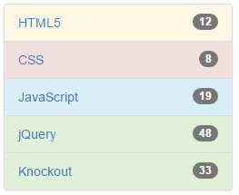
self.listData = ko.observableArray([
new listItem("HTML5",12),
new listItem("CSS",8),
new listItem("JavaScript",19),
new listItem("jQuery",48),
new listItem("Knockout",33)
]);
Each item in our array will have display, students, and type variables. We are using a number of features in Bootstrap here but packaging them all up inside our Bootstrap smart tag. This tag starts to go beyond the bare basics. It is still very implementable, but we don't want to throw too much at you to absorb at one time, so we will not go into the detailed code for this tag. What we do want to show is how much power can be wrapped into custom Knockout tags. Here is the markup we will use to call this tag and bind the correct part of viewModel for display:
<kom-listgroup data="listData" badgeField="'students'" typeField="'type'"></kom-listgroup>
That is it. You should take note of a couple of special details. The data is passed in as a bound Knockout ViewModel. The badge field is passed in as a string name to declare the field on the data collection where the badge count will be pulled. The same string approach has been used for the type field. The type will set the colors as per standard Bootstrap types. The theme here is that if there are not enough students to hold a class, then it shows the danger color in the list group custom tag. Here is what it looks like in the browser when we run the code:
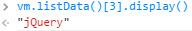
While this is neat, let's jump into our browser tools console and change the value of one of the items. Let's say there was a class on some cool web technology called jQuery. What if people had not heard of it and didn't know what it was and you really wanted to take the class? Well, it would be nice to encourage a few others to check it out. How would you know whether the class was at a danger level or not? Well, we could simply use the badge and the numbers, but how awesome is it to also use the color coding hint? Type the following code into the console and see what changes:
vm.listData()[3].display()
Because JavaScript starts counting with zero for the first item, we will get the following result:
Unlock access to the largest independent learning library in Tech for FREE!
Get unlimited access to 7500+ expert-authored eBooks and video courses covering every tech area you can think of.
Renews at €14.99/month. Cancel anytime
Now we know we have the right item, so let's set the student count to nine using the following code in the browser console:
vm.listData()[3].students(9)
Notice the change in the jQuery class. Both the badge and the type value have updated. This screenshot of the update shows how much power we can wield with very little manual coding:

We should also take a moment to see how the type was managed. Using the functional assignment, we were able to use the Knockout computed binding for that value. Here is the code for that part again:
this.type = ko.computed(function(){
switch(Math.ceil(this.students()/5)){
   case 1:
   case 2:
     return 'danger';
     break;
   case 3:
     return 'warning';
     break;
   case 4:
     return 'info';
     break;
   default:
     return 'success';
}
},this);
While the code is outside the viewModel declaration, it is still able to bind properly to make our code run even inside a custom tag created with Knockout's component binding.
Bootstrap component example
Here is another example of binding with Bootstrap. The general best practice for using modal display boxes is to place them higher in the code, perhaps under the body tag, to make sure there are no conflicts with the rest of the code. Place this tag right below the body tag as shown in the following code:
<kom-modal id="'komModal'" title="komModal.title()" body="komModal.body()"></kom-modal>
Again, we will need to make some declarations inside viewModel for this to work right. Enter this code into the declarations of viewModel:
self.komModal = {
title: ko.observable('Modal KOMponent'),
body: ko.observable('This is the body of the <strong>modal   KOMponent</strong>.')
};
We will also create a button on the page to call our viewModel. The button will use the binding that is part of Bootstrap. The data-toggle and data-target attributes are not Knockout binding features. Knockout works side-by-side wonderfully though. Another point of interest is the standard ID attribute, which tells how Bootstrap items, like this button, interact with the modal box. This is another reason it may be beneficial to use KOmponents or a library like it. Here is the markup code:
<button type="button" data-toggle="modal" data- target="#komModal">Open Modal KOmponent</button>
When we click on the button, this is the requestor we see:

Now, to understand the power of Knockout working with our requestor, head back over to your browser tools console. Enter the following command into the prompt:
vm.komModal.body("Wow, live data binding!")
The following screenshot shows the change:

Who knows what type of creative modular boxes we can build using this type of technology. This brings us closer towards creating what we can imagine. Perhaps it may bring us closer to building some of the wild things our customers imagine. While that may not be your main motivation for using Knockout, it would be nice to have a few less roadblocks when we want to be creative. It would also be nice to have this wonderful ability to package and reuse these solutions across a site without using copy and paste and searching back through the code when the client makes a change to make updates.
Again, feel free to look at the file to see how we made these components work. They are not extremely complicated once you get the basics of using Knockout and its components. If you are looking to build components of your own, they will help you get some insight on how to do things inside as you move your skills to the next level.
Understanding the AMD approach
We are going to look into the concept of what makes an AMD-style website. The point of this approach to sites is to pull content on demand. The content, or modules as they are defined here, does not need to be loaded in a particular order. If there are pieces that depend on other pieces, that is, of course, managed. We will be using the RequireJS library to manage this part of our code.
We will create four files in this example, as follows:
- amd.html
- amd.config.js
- pick.js
- pick.html
In our AMD page, we are going to create a configuration file for our RequireJS functionality. That will be the amd.config.js file mentioned in the aforementioned list. We will start by creating this file with the following code:
// require.js settings
var require = {
   baseUrl: ".",
   paths: {
       "bootstrap":       "/share/js/bootstrap.min",
       "jquery":           "/share/js/jquery.min",
       "knockout":         "/share/js/knockout",
       "text":             "/share/js/text"
   },
   shim: {
       "bootstrap": { deps: ["jquery"] },
       "knockout": { deps: ["jquery"] },
   }
};
We see here that we are creating some alias names and setting the paths these names point to for this page. The file could, of course, be working for more than one page, but in this case, it has specifically been created for a single page. The configuration in RequireJS does not need the .js extension on the file names, as you would have noted.
Now, we will look at our amd.html page where we pull things together. We are again using the standard page we have used for this article, which you will notice if you preview the done file example of the code. There are a couple of differences though, because the JavaScript files do not all need to be called at the start. RequireJS handles this well for us. We are not saying this is a standard practice of AMD, but it is an introduction of the concepts.
We will need to include the following three script files in this example:
<script src="/share/js/knockout.js"></script>
<script src="amd.config.js"></script>
<script src="/share/js/require.js"></script>
Notice that the configuration settings need to be set before calling the require.js library. With that set, we can create the code to wire Knockout binding on the page. This goes in our amd.html script at the bottom of the page:
<script>
ko.components.register('pick', {
viewModel: { require: 'pick' },
template: { require: 'text!pick.html' }
});
viewModel = function(){
this.choice = ko.observable();
}
vm = new viewModel();
ko.applyBindings(vm);
</script>
Most of this code should look very familiar. The difference is that the external files are being used to set the content for viewModel and template in the pick component. The require setting smartly knows to include the pick.js file for the pick setting. It does need to be passed as a string, of course. When we include the template, you will see that we use text! in front of the file we are including. We also declare the extension on the file name in this case. The text method actually needs to know where the text is coming from, and you will see in our amd.config.js file that we created an alias for the inclusion of the text function.
Now, we will create the pick.js file and place it in the same directory as the amd.html file. It could have been in another directory, and you would have to just set that in the component declaration along with the filename. Here is the code for this part of our AMD component:
define(['knockout'], function(ko) {
   function LikeWidgetViewModel(params) {
       this.chosenValue = params.value;
       this.land = Math.round(Math.random()) ? 'heads' : 'tails';
   }
   LikeWidgetViewModel.prototype.heads = function() {
       this.chosenValue('heads');
   };
   LikeWidgetViewModel.prototype.tails = function() {
       this.chosenValue('tails');
   };
   return LikeWidgetViewModel;
});
Notice that our code starts with the define method. This is our AMD functionality in place. It is saying that before we try to execute this section of code we need to make sure the Knockout library is loaded. This allows us to do on-demand loading of code as needed. The code inside the viewModel section is the same as the other examples we have looked at with one exception. We return viewModel as you see at the end of the preceding code. We used the shorthand code to set the value for heads and tails in this example.
Now, we will look at our template file, pick.html. This is the code we will have in this file:
<div class="like-or-dislike" data-bind="visible: !chosenValue()">
<button data-bind="click: heads">Heads</button>
<button data-bind="click: tails">Tails</button>
</div>
<div class="result" data-bind="visible: chosenValue">
   You picked <strong data-bind="text: chosenValue"></strong>
   The correct value was <strong data-bind="text:   land"></strong>
</div>
There is nothing special other than the code needed to make this example work. The goal is to allow a custom tag to offer up heads or tails options on the page. We also pass in a bound variable from viewModel. We will be passing it into three identical tags.
The tags are actually going to load the content instantly in this example. The goal is to get familiar with how the code works. We will take it to full practice at the end of the article. Right now, we will put this code in the View segment of our amd.html page:
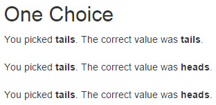
<h2>One Choice</h2>
<pick params="value: choice"></pick><br>
<pick params="value: choice"></pick><br>
<pick params="value: choice"></pick>
Notice that we have included the pick tag three times. While we are passing in the bound choice item from viewModel, each tag will randomly choose heads or tails. When we run the code, this is what we will see:

Since we passed the same bound item into each of the three tags, when we click on any heads or tails set, it will immediately pass that value out to viewModel, which will in turn immediately pass the value back into the other two tag sets. They are all wired together through viewModel binding being the same variable. This is the result we get if we click on Tails:
Well, it is the results we got that time. Actually, the results change pretty much every time we refresh the page. Now, we are ready to do something extra special by combining our AMD approach with Knockout modules.
Summary
This article has shown the awesome power of templates working together with ViewModels within Knockout components. You should now have an awesome foundation to do more with less than ever before. You should know how to mingle your jQuery code with the Knockout code side by side.
To review, in this article, we learned what Knockout components are. We learned how to use the components to create custom HTML elements that are interactive and powerful. We learned how to enhance custom elements to allow variables to be managed using the more common attributes approach. We learned how to use an AMD-style approach to coding with Knockout. We also learned how to AJAX everything and integrate jQuery to enhance Knockout-based solutions.
What's next? That is up to you. One thing is for sure, the possibilities are broader using Knockout than they were before. Happy coding and congratulations on completing your study of KnockoutJS!
Resources for Article:
Further resources on this subject:

 United States
 Great Britain
 India
India
 Germany
 France
 Canada
 Russia
 Spain
Spain
 Brazil
 Australia
 South Africa
 Thailand
 Ukraine
 Switzerland
 Slovakia
 Luxembourg
 Hungary
 Romania
 Denmark
 Ireland
 Estonia
 Belgium
 Italy
Italy
 Finland
 Cyprus
 Lithuania
 Latvia
 Malta
Malta
 Netherlands
 Portugal
 Slovenia
 Sweden
 Argentina
 Colombia
 Ecuador
 Indonesia
 Mexico
 New Zealand
 Norway
 South Korea
 Taiwan
 Turkey
 Czechia
 Austria
 Greece
 Isle of Man
 Bulgaria
 Japan
Japan
 Philippines
 Poland
 Singapore
 Egypt
Egypt
 Chile
Chile
 Malaysia


